Real-Life Browse Abandonment Emails from Top Brands [and Why They Convert]

Summarize with


Most stores obsess over cart abandonment, but the real revenue leaks happen before a product even reaches the cart. Visitors browse, pause, and leave without committing, and by the time they’re ready to buy, your competitors might already be in the picture.
This is where browse abandonment emails shine. They catch interest while it’s fresh, influence decisions before they harden, and give you the chance to convert casual browsers into loyal customers, all before the cart stage even begins.
What is a Browse Abandonment Email?
A browse abandonment email is triggered when someone views one or more product pages and leaves your store without completing a purchase.
In lifecycle terms, this sits at the top of your conversion funnel. The visitor has moved beyond casual browsing and shown clear product-level interest. They’re no longer anonymous; they’re a warm lead in the decision phase.
The flow is straightforward:
track product views > wait for a defined period of inactivity > send a contextual email > bring them back to where they left off
Here’s how browse abandonment compares to cart abandonment:
| Browse abandonment | Cart abandonment |
|---|---|
| Earlier lifecycle stage | Later lifecycle stage |
| Lower commitment threshold | Higher purchase intent |
| Persuasion and value reinforcement focus | Recovery and objection-handling focus |
| Product viewer left before adding to cart | Buyer added to cart but didn’t complete purchase. |
Though both tactics recover lost revenue, browse abandonment works earlier, when the buyer is still forming their opinion.
When Browse Abandonment Emails Work Best
Messaging tone and timing for browse abandonment emails should be entirely different than cart abandonment emails.
To get a general idea of your business, when browsing abandonment emails will work best for your customer, check the points noted below:
- High-consideration products: Non-impulse purchases (furniture, electronics, premium apparel) where customers browse and compare, browse abandonment keeps you top of mind during that window.
- Competitive markets: When buyers compare across multiple stores, leaving doesn’t mean evaluation. Browse abandonment brings them back before a competitor wins.
- Repeat browsing behavior: Visitors who view the same product or related items are actively evaluating. Browse abandonment emails at this stage reinforce value and guide their decision.
- Traffic from paid campaigns: Visitors from ads who view products and leave can be recaptured. Browse abandonment emails extend ad value by giving a second chance to convert without extra spend.
When not to use browse abandonment emails:
- Anonymous visitors: Without an email, you can’t follow up. Use lead capture strategies like lead magnets, exit popups, or account sign-ups first.
- Ultra-low-price impulse products: Low-cost items are buy-or-skip instantly; browse abandonment adds very little value.
Core Elements of a High-Converting Browse Abandonment Email
A browse abandonment email’s goal is simple: get the visitor back to your product page to continue their decision, without closing the sale in the email itself.
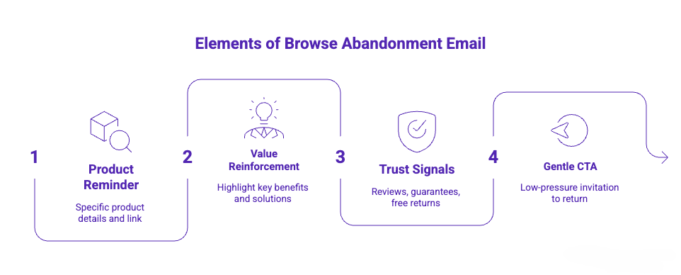
Core elements of a high-converting browse abandonment email include:
- Product reminder: Reference the exact product with name, image, and link. Specificity drives clicks; generic emails get ignored.
- Value reinforcement: Highlight 1–2 key benefits or solutions the product offers to re-anchor interest.
- Trust signals: Address hesitation with reviews, guarantees, free returns, or secure checkout. Build confidence without overwhelming detail.
- Gentle return CTA: Low-pressure invites like “View product again” or “Continue browsing” guide them back without aggressive sales language.
- Optional incentive: Use small discounts or free shipping only if margins allow and the price is a real objection. Avoid training customers to wait for offers.
Psychology here is, unlike cart abandonment, this email strengthens interest before the buying decision is made.
11 Top Brands’ Browse Abandonment Email Examples
Let’s look at four proven patterns with real email copy examples. Each one works in different situations. Pick the pattern that matches your product type, customer behavior, and positioning strategy.
1. Simple Reminder Browse Abandonment Email
Sometimes people just forget. They got distracted, a Slack message interrupted them, or they meant to come back later and didn’t. A simple, clean reminder is enough to bring them back.
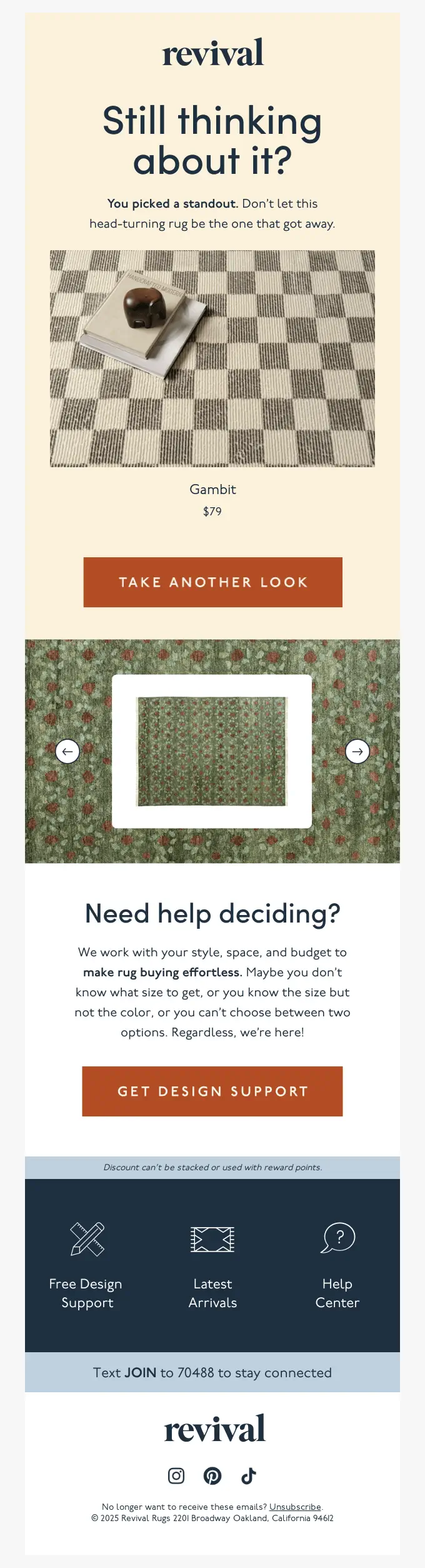
When to use it: It works best for high-trust brands and products with strong inherent appeal. In these cases, a simple reminder of the abandonment without over-complicating the core message. When the product is really good, a detailed image and features of the product work the best.
Why it Works
- Start with an intriguing question: “Still thinking about it?”
- Asks the reader to take another look to decide properly
- Offer an option to get design support for size, texture, design, and color
- Shows a detailed image of the product, and the viewer checked out
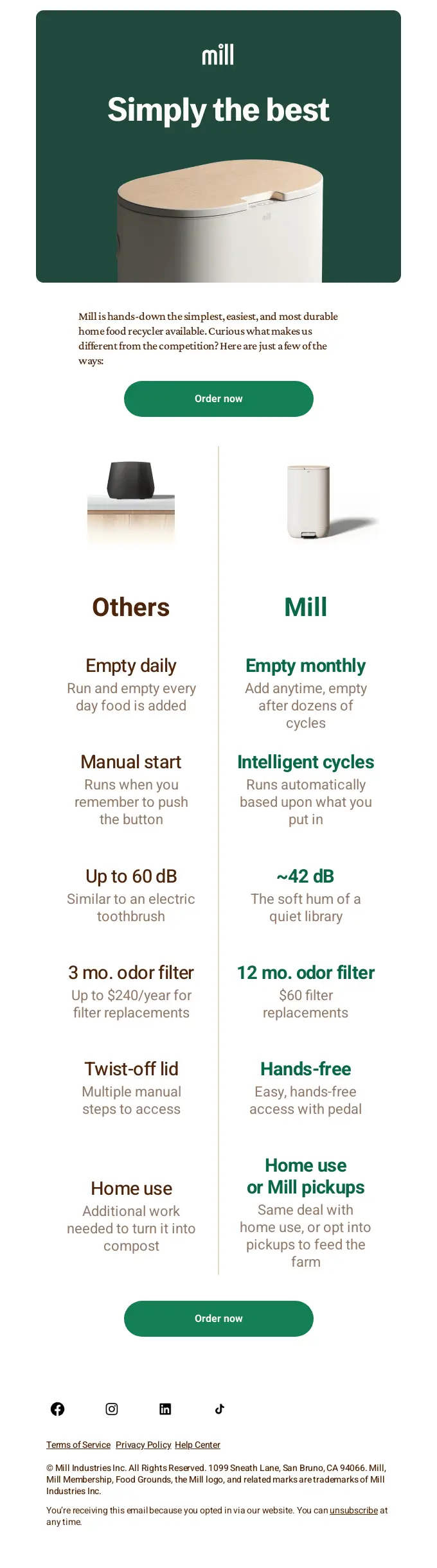
2. Value-Focused Browse Abandonment
Buyers leave product pages because they’re not fully convinced of value. This pattern re-anchors the core benefits and addresses “why this product” without being pushy. It works particularly well when your product has features competitors don’t.
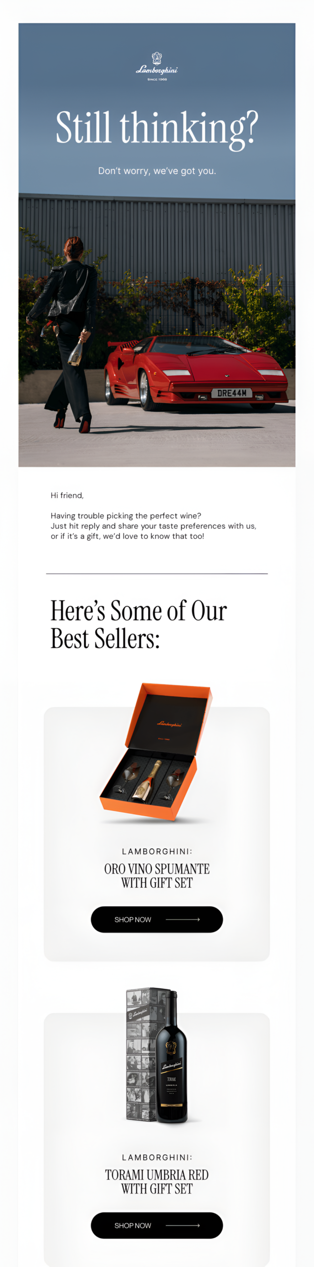
When to Use it: Value-focused reinforcement email works for products with multiple benefits, premium or high-consideration items, or when the brand is competing in a crowded market and needs to differentiate itself from others.
Why it Works
- Showcase images of a beautful lamborghini that the viewer noticed
- The image shows a model with the car and the complimentary gift
- Showcases the complimentary gift and highlights how premium the gift is
- Showcases the best seller in case the viewer wants to check out more options
3. Social-Proof Abandonment Email
If someone left without buying, they might not trust that the product delivers what you claim. Social proof removes that doubt. This works especially well for new stores, lesser-known brands, or products that require a leap of faith (fitness gear, digital products, premium items).
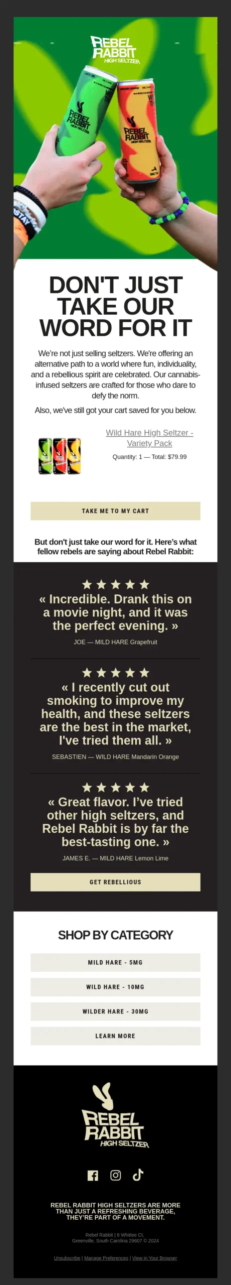
When to use it: It works best when buyers are interested but not fully convinced yet. In these cases, adding reviews, testimonials, or real customer experiences helps validate the product without sounding pushy. When trust is the main barrier, strong social proof reassures buyers and makes the decision easier.
Why it Works
- Start with a catchy “Don’t take our words for it.”
- Write a few lines on how their products are better
- Showcase multiple social proofs of their products
- Below the social proofs offer an option to shop by category
4. Incentive-Based Browse Abandonment Email
Some buyers are waiting for a deal. If you’re comfortable offering one, this removes the price objection directly. But be strategic. If you always offer a discount, you’re training customers to wait. Reserve this for high-value products, competitive situations, or as a last-chance tactic after other emails failed.
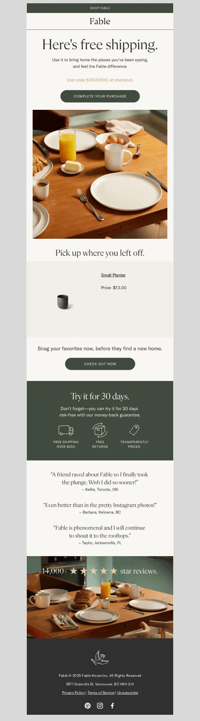
When to use it: It works best when buyers are interested but holding back due to price. In these cases, a small discount or incentive helps remove that final barrier without overcomplicating the message. Use it as a follow-up when earlier emails didn’t convert, and price is the main hesitation.
Why it Works
- Offers the incentive “Free Shipping” before anything else
- Adds a fomo line “before they find a new home.”
- Offer a coupon to decrease the total cost of the product
- Adds multiple social proof and a total great review count
5. FOMO Driven Browse Abandonment Email
Sometimes the hesitation isn’t about value, it’s about timing. Buyers delay decisions, assuming the product will still be there later. A low-stock reminder creates a reason to act now before they miss out.
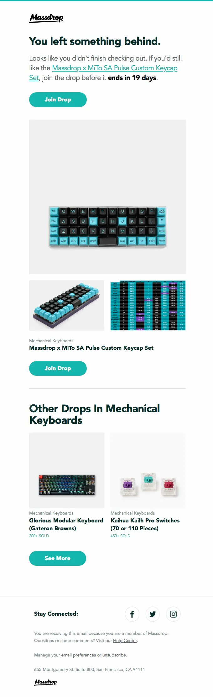
When to use it: It works best when buyers are interested but delaying the decision. In these cases, highlighting limited stock or high demand creates urgency without being overly aggressive. When availability is uncertain, a subtle FOMO trigger pushes them to act before they miss out.
Why it Works
- Triggers FOMO behavior with a fixed timeline, ‘Before 19 days.’
- Showcase a clear, detailed image of the product the viewer is interested in
- Showcase similar products of viewer interest to provide more options
- Adds a clean CTA of ‘Join the drop’ to evoke the sense of a new product launch
6. Comparison Browse Abandonment Email
Sometimes buyers don’t leave because they’re uninterested; they leave because they’re comparing. Too many options create hesitation. A comparison-focused email helps simplify the decision by showing how your product stands out.
When to use it: Ideal for complex or high-consideration products where users need clarity before making a decision. Works especially well in competitive markets where buyers are actively comparing multiple alternatives and weighing trade-offs. Use this when your audience is likely stuck in evaluation mode, uncertain about differences, value, or long-term benefits.
Why it Works
- Starts by showcasing the image of the product that the viewer took an interest in
- Draws a clear comparison between the products of the market and theirs
- Highlights the sectors where they are better than the market in their brand color
- Adds a clear CTA in their brand color, saying “order now.”
7. FAQ-Based Browse Abandonment Email
Sometimes buyers leave because they have unanswered questions about shipping, returns, quality, or fit. Instead of waiting for them to ask, this email addresses those concerns upfront and removes hesitation.
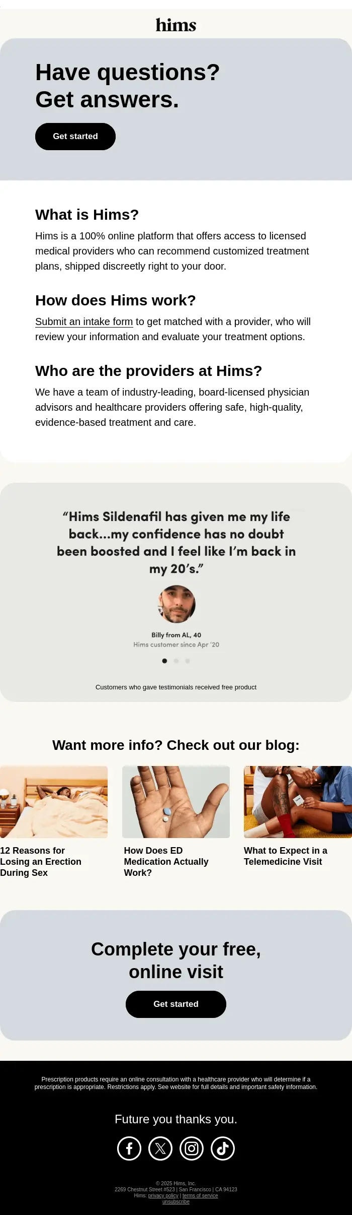
When to use it: Ideal for objection-heavy products, higher-priced items, or any purchase where hesitation comes from unanswered questions. Use this when prospects are browsing but not converting because they’re uncertain about details like pricing, features, compatibility, or policies. It works especially well if you’ve identified recurring pre-purchase questions through support tickets, sales conversations, or on-site behavior.
Why it Works
- Starts with a playful headline that summarizes the gist of the email and the user’s pain point
- Answers the question serially by answering who they are, and how they work in the background
- Adds a segment of social proof of satisfied users, which requires the receiver not to slide down
- Links to their blog to answer more questions the visitor may have about them
8. Founder’s Message Browse Abandonment Email
Some buyers aren’t looking for more product details; they’re looking for trust. A personal note from the founder or team adds authenticity, context, and credibility, making the product feel intentional and meaningful.
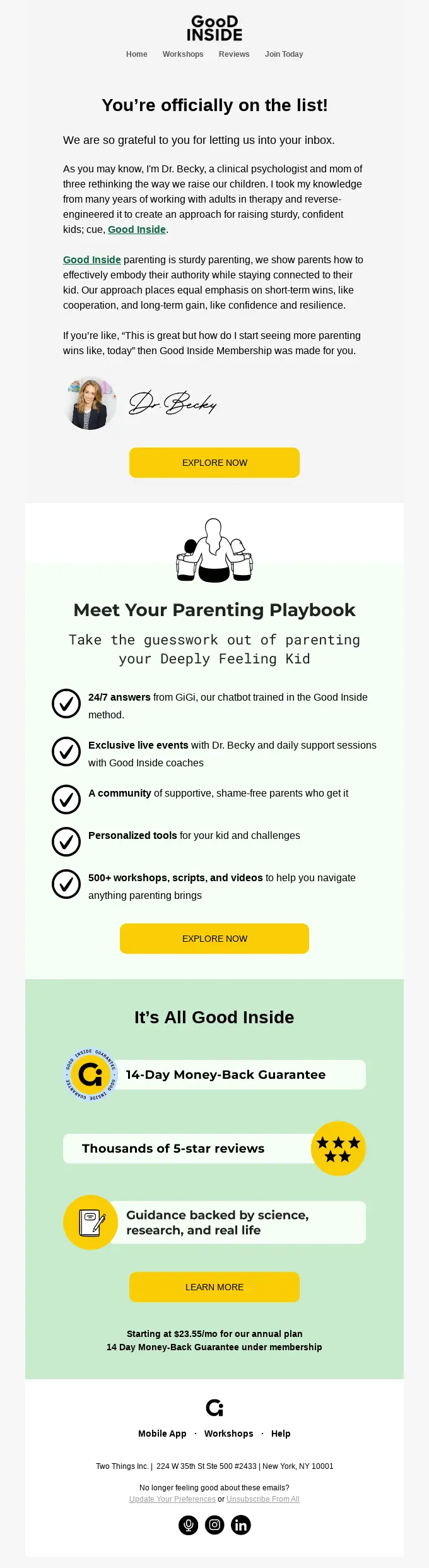
When to use it: Use this when your brand has a human behind it that customers can connect with, especially in direct-to-consumer or founder-led businesses where trust isn’t just built on product features, but on story, intent, and personality.
It works particularly well if your product carries a deeper narrative (craftsmanship, mission, personal journey) and when your audience needs a stronger emotional nudge rather than another generic reminder.
Why it Works
- Puts a humble message in a grateful tone to the receiver
- Highlights the pain points of the product’s target audience
- Adds a clear CTA to explore more, along with the features
- Offers a 14-day money-back guarantee with a learn more CTA
9. Repeat Visit Recognition Browse Abandonment Email
Sometimes buyers return multiple times without purchasing. A repeat-visit email acknowledges this behavior, subtly reinforcing awareness of their interest and encouraging the next step. This can include messaging like “We noticed you’ve been exploring…” or highlighting previously viewed products.
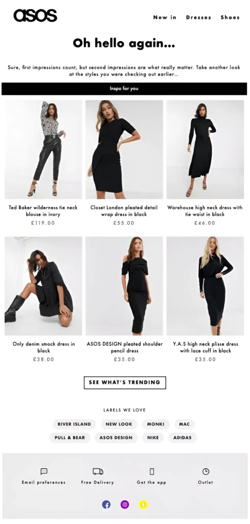
When to use it: Target users who have shown a strong interest by visiting the same product or category multiple times. This works especially well for high-consideration or premium items, where customers may need extra reassurance before purchasing. Use this approach to gently remind them of what caught their attention, build trust, and subtly nudge them toward completing the purchase.
Why it Works
- Start with “Hello again” to express that they recognize the visitor
- Write a short intro to entice visitors to check out the product they are interested in
- Showcases the products users liked along with their prices
- Adds a CTA to explore what is trending to build more interest from the visitor
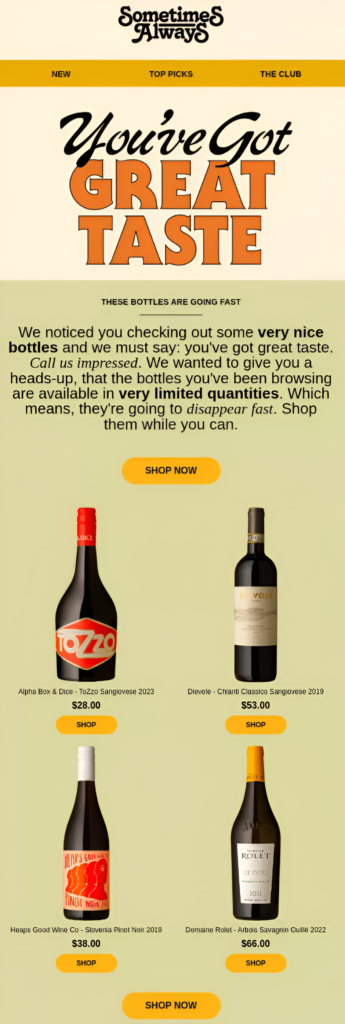
10. Cross-Sell Browse Abandonment Email
Sometimes buyers hesitate because they’re not sure if a single product meets their needs. A bundle or cross-sell email suggests complementary items or kits, showing how products work together for greater value. This can include “Frequently bought together” or curated pairings.
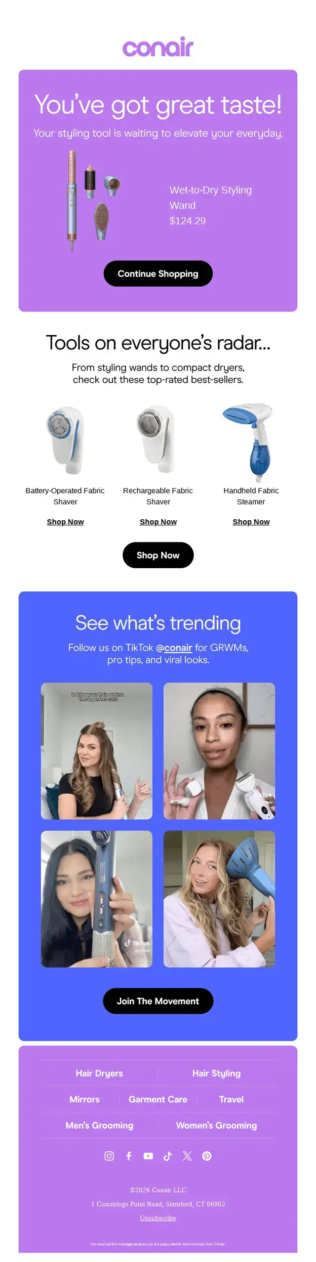
When to use it: Ideal for promoting complementary products, add-ons, or related categories that enhance the value of what a customer is already interested in. This approach works especially well when your products fit together seamlessly, creating a more complete experience and boosting the likelihood of additional sales.
Why it Works
- Flatter the visitor by complimenting them with “You have great taste.”
- Adds a CTA right beside the product to continue shopping right away
- Showcase products that most visitors like from the brand, with an individual visit option
- Showcase ‘What’s Trending’ with a CTA to ‘Join the Movement’ to further entice visitors
11. Soft Checking Browse Abandonment Email
Sometimes buyers need a gentle nudge without feeling pressured. A soft check-in email reminds them of their interest and invites them to return, often with light, friendly copy like “Still thinking it over?” or “Just checking in—you might like this.”
When to use it: Use this as the final nudge in a browse abandonment sequence, especially if previous emails haven’t led to a conversion. It’s ideal for gently reminding users of what they were interested in without being pushy. This email can reinforce value, address potential hesitations, or offer a subtle incentive to encourage action before the opportunity passes.
Why it Works
- Showcases their best products, which are of similar interest to the visitor
- Adds fomo elment by highlighting that the products are available in limited quantities
- Adds a CTA to shop now with a ‘We are impressed’ note to complement the visitors
- Showcases the products with an individual shop option available for each product
Quick Tip: If your business is e-commerce centric, then you can boost your revenue by implementing these browse abandonment emails in your ecommerce automation flow.
How Browse Abandonment Fits Into the eCommerce Lifecycle
Browse abandonment emails aren’t just isolated messages; they’re an integral part of a buyer’s journey, guiding visitors from casual browsing to loyal repeat customers.
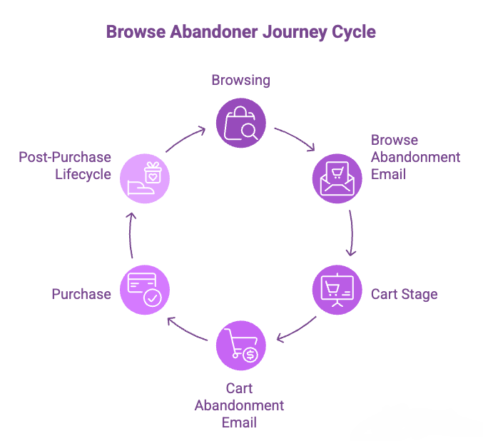
Here’s how they fit into the full lifecycle:
- Browsing: A visitor explores your product pages but leaves without taking action. At this stage, they’re simply interested.
- Browse Abandonment Email: This is your gentle reminder. By referencing the products they viewed, you start recovery early—nudging them back without being pushy.
- Cart Stage: When a visitor adds items to their cart but doesn’t complete checkout, they become a warm lead.
- Cart Abandonment Email: Here, you tackle friction points—highlighting shipping info, customer testimonials, or limited-time offers to motivate purchase.
- Purchase: The visitor completes the checkout, converting into a customer.
- Post-Purchase Lifecycle: After the sale, automated post-purchase sequences maintain engagement through order updates, product tips, review requests, and upsell opportunities, turning one-time buyers into repeat customers.
Key takeaway here is that browse abandonment sits at the very top of the conversion funnel. By engaging early, you increase the chance of turning casual browsers into active buyers, making the entire lifecycle more efficient and profitable.
Quick Tip: If you are facing way too much browsing abandonment, then you probably have an issue to fix. Check out this complete ecommerce email marketing guide to fix that.
Common Browse Abandonment Email Mistakes
Even the best products can get ignored if your browse abandonment emails miss the mark. These common mistakes kill conversions before they even start—avoid them to turn window shoppers into buyers:
- Generic emails without product context: Always include product name, image, and link.
- Waiting too long to send: Send within a few hours, while the product is top-of-mind.
- Aggressive sales tone too early: Use a conversational, low-pressure approach; don’t push for a sale.
- Ignoring repeat visitors: Segment users who view the same product multiple times; treat them as warm leads.
- Sending identical emails to everyone: Tailor by product price, category, or browsing behavior.
- Overloading with too much information: Keep emails focused and scannable; too many products or text can overwhelm.
- Neglecting mobile optimization: Ensure images, links, and CTA buttons are designed for mobile optimization.
- Failing to reinforce value or benefits: Remind buyers why this product matters.
- Skipping social proof or trust signals: Reviews, ratings, or testimonials build confidence.
- Ignoring follow-up sequence logic: One email isn’t enough; create a timed sequence with behavior-based segmentation.
Key takeaway from here is that behavior-driven, relevant, and timely emails convert leads, generic blasts don’t.
Turn Browsers into Buyers
Browse abandonment emails give you the first-mover advantage in the buyer’s journey. They catch interest while it’s fresh, guide decisions gently, and build trust before a product even hits the cart. By focusing on relevance, timing, and email personalization, you’re not just sending emails; you’re shaping experiences that convert.
Get your messaging right, avoid common pitfalls, and use behavior-driven automation strategically. When done well, browse abandonment emails turn casual visitors into loyal customers with minimal effort. The takeaway is that sending short, well-timed nudges at the right moment can unlock big revenue.
So, start catching your buyers before they even leave the cart.
Samira Farzana
Once set out on literary voyages, I now explore the complexities of content creation. What remains constant? A fascination with unraveling the “why” and “how,” and a knack for finding joy in quiet exploration, with a book as my guide- But when it’s not a book, it’s films and anime.
Table of Content
Related Articles and Topics
-
20 Monthly Newsletter Ideas for When You’re Out of Ideas [+ Real-life Examples]
Even the best ideas fail if your newsletter never lands. Many marketers freeze at a…
-
12 Subscription Renewal Email Examples from Leading Brands That Boost Customer Retention and Reduce Churn
Subscriptions are powerful for one simple reason: Growth doesn’t come from one purchase; it comes…