12 Lead Capture Landing Page Examples with Conversion Frameworks Used by Top Brands


Many businesses build landing pages, drive traffic, and place forms above the fold. Yet conversion rates remain inconsistent. Visitors scroll, skim, and leave. The traffic is there. The offer exists. The form works.
The problem is rarely the form. The problem is usually the absence of a clear lead capture structure.
This guide explains what a lead capture landing page actually is, how high-converting pages are structured, and the frameworks that turn anonymous visitors into qualified leads.
What is a Lead Capture Landing Page?
A lead capture landing page is not your homepage. It’s not a product page, and it’s not a portfolio or design showcase. It serves a much more focused purpose: turning anonymous visitors into identifiable leads.
Instead of asking visitors to explore the entire website, the page offers something specific and valuable in exchange for contact information. That exchange creates the first point of access for future communication.
The table below clarifies how a lead capture landing page differs from other common website pages and why its structure matters:
| Aspect | Homepage | Landing Page (Lead Capture) | Product Page |
|---|---|---|---|
| Primary Goal | Introduce the brand and guide visitors across the website | Convert visitors into leads by capturing contact information | Explain a specific product and drive purchase or trial |
| Core Purpose | Distribute attention across multiple sections of the site | Focus attention on one clear action | Help visitors evaluate whether the product fits their needs |
| Typical Content | Brand story, navigation menus, product categories, featured content | Value proposition, benefit-focused copy, minimal form, single CTA | Product features, specifications, pricing, demos, comparisons |
| Number of CTAs | Multiple (explore product, read blog, sign up, etc.) | Single primary CTA | Usually one main CTA (buy, start trial, add to cart) |
| Visitor Intent | Exploration and discovery | Quick decision to access a resource or benefit | Evaluation before making a purchase decision |
| Structure | Broad layout designed for navigation | Focused structure designed for conversion | Detailed explanation designed for product understanding |
| Conversion Outcome | Site engagement and exploration | Email sign-up or lead generation | Purchase, trial signup, or product inquiry |
What Is a Lead Nurture Framework?
A lead nurture framework is a structured system that guides a lead from initial interest to decision readiness. Instead of sending random follow-up emails or generic campaigns, the framework organizes communication into a logical progression that reflects how people actually make decisions.
You can take a look at the lead nurturing funnel to visualize better what the lead nurturing framework actually means.
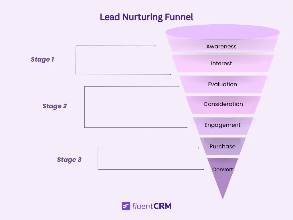
At its core, a lead nurture framework answers three strategic questions:
- What does the lead understand right now?
- What information will help them move forward?
- What action signals that they are ready for the next step?
The process usually begins with a lead capture landing page. When a visitor downloads a guide, joins a newsletter, or signs up for a resource, they are not simply added to an email list. They enter a structured system designed to continue the conversation. From there, the framework activates supporting elements such as:
- Educational email sequences
- Behavioral segmentation
- Automation workflows
- Evaluation and decision-support content
Together, these components create a guided journey instead of disconnected campaigns.
How a Lead Nurture Framework Strengthens the Lead Capture Page?
The landing page is the entry point into a progression system. What it promises must align with what happens next. The first nurture message should feel like a continuation, not a reset.
Strong alignment means:
- Setting clear expectations about what the lead will receive
- Matching tone and value between the page and the first follow-up
- Segmenting based on interest, role, or use case
- Attracting the right stage of awareness
For example, early-stage pages should emphasize education and clarity. Mid-stage offers can introduce comparison guides or evaluation frameworks. Late-stage capture pages may focus on trials or demos. When capture and nurture are disconnected, friction increases. When they are aligned, continuity builds trust.
Progress in framework-based nurturing is measurable. It maintains this flow:
Awareness ——-> Understanding ———> Evaluation ——–> Readiness ——> Revenue
In short, framework-based nurturing works because it structures the path, rather than leaving leads to wander. It transforms a yes at capture into meaningful momentum toward a decision.
Why Most Lead Capture Pages Underperform
Most lead capture pages fail not because of design flaws or technical issues, but because they lack strategic alignment with the lead journey.
Common reasons lead capture pages fail include:
- Overcomplicated forms: Asking for too much information too early increases friction and discourages signups.
- Weak or unclear headlines: Visitors need instant clarity on the value they’ll receive; vague or clever copy slows engagement.
- Ignoring post-submission flow: Collecting an email is only the start; lack of follow-up or nurturing breaks momentum.
- Misaligned page type and traffic source: A page aimed at beginners won’t perform for advanced prospects, and a hard-sell page fails for top-of-funnel traffic.
- Unfocused benefits: Listing features without explaining the transformation leaves visitors unsure of the real value.
- No behavioral guidance: Without clear next steps or visual cues, visitors hesitate and drop off.
- Slow load times or technical hiccups: Even slight delays can interrupt engagement and reduce conversions.
- Lack of social proof or credibility: Without validation, visitors hesitate to share their information.
When every element is purposeful, headline, benefits, form, CTA, and post-submission flow- the page becomes a conversion engine. Strategic design stabilizes results and maximizes the value of every visitor.
Types of Lead Capture Landing Page Frameworks You Can Follow
Frameworks make conversion repeatable. Instead of guessing layouts, you apply structural logic. Here are four high-performing frameworks used across SaaS, eCommerce, course businesses, and B2B services you can take your ideas from:
Framework 1: The Problem Solution Lead Capture Landing Page
The Problem–Promise Page starts by clearly naming a pain point before presenting the lead magnet as the path to relief. It works best when the audience is already aware of the problem and actively seeking solutions. Visitors do not respond to generic promises—they respond when their frustration is reflected, and a clear outcome is offered.
This framework begins with a headline that identifies the exact problem, supported by a subheadline that presents a specific, tangible outcome. Benefit bullets reinforce the transformation, and a single, focused call-to-action drives the next step.
For example:
Stop Losing Leads After They Sign Up
Download the 7-Step Lead Follow-Up Blueprint Used by High-Growth SaaS Teams.
✔ Automation flow map
✔ Follow-up timing structure
✔ Segmentation logic
[Get the Blueprint]
The sequence matters. Naming the pain first captures attention. Presenting a clear solution reduces hesitation. Benefits illustrate the transformation. The single CTA keeps the decision simple.
This framework converts because it validates the problem before offering the solution. When frustration is acknowledged and the outcome is specific, the exchange feels logical rather than promotional. Pain creates recognition. Clarity drives action.
Framework 2: The Authority-Based Lead Capture Landing Page
The Authority-Based Page leads with credibility before presenting the offer. It works best in competitive or skeptical markets where trust is the primary barrier to conversion. When visitors are uncertain, they do not respond to promises first; they respond to proof.
This framework begins with a credibility-driven headline, supported by clear social proof such as user numbers, testimonials, client logos, or measurable outcomes. Once authority is established, the offer is introduced with clarity and specificity, followed by a single, focused call to action.
For example:
Trusted by 12,000+ Marketers
Get the Exact Lead Funnel Template Our Clients Use to Increase Conversions.
[Download the Template]
The sequence matters. Credibility lowers perceived risk. Social proof reinforces legitimacy. A clear explanation of the offer removes ambiguity. The single CTA keeps the decision simple.
This framework converts because it stabilizes the decision environment. Instead of asking visitors to trust you after they see the offer, it earns trust before presenting it. When authority is clear and the value is specific, the exchange feels logical rather than promotional.
Authority creates confidence. Clarity creates action.
Framework 3: The Curiosity Hook Lead Capture Landing Page
The Curiosity Hook Page uses intrigue to trigger action. Instead of leading with proof or pain, it captures attention by introducing an information gap, something the visitor feels compelled to close.
This framework works particularly well for newsletters, media brands, educators, and thought leaders. It performs best when the audience values insight, perspective, or insider knowledge rather than immediate tactical downloads.
The structure is intentionally minimal. It begins with an intriguing headline that suggests overlooked knowledge or a hidden advantage. That curiosity is immediately anchored to a clear benefit, so the visitor understands what they gain. Supporting copy remains brief to reduce friction, followed by a simple, single-field form and focused call to action.
For example:
The Email Strategy Most SaaS Founders Ignore
Join 8,000+ marketers getting weekly teardown insights.
[Subscribe Now- Subscribe Form]
Start with a catchy copy. Intrigue captures attention. Clarity defines value. Simplicity lowers effort.
This framework converts because curiosity reduces hesitation. When visitors sense there is useful insight they might be missing, momentum builds naturally. Short copy keeps cognitive load low, allowing the decision to feel quick and effortless.
However, intrigue must always connect to relevance. Curiosity alone attracts attention. Curiosity tied to a meaningful benefit drives conversion.
Framework 4: The Value Stack Lead Capture Landing Page
The Value Stack Page increases perceived return by layering multiple benefits into a single, cohesive offer. Instead of presenting one asset, it presents a structured bundle that makes the exchange feel substantial.
This framework works best for webinars, toolkits, template libraries, workshops, and comprehensive lead magnets where the value can be clearly itemized. It is especially effective when the goal is to elevate perceived worth beyond a simple “free download.”
The structure begins with an outcome-driven headline that defines transformation, not just access. That outcome is reinforced by stacked benefit bullets, each highlighting a specific component of the offer. Optional bonuses can be introduced to strengthen perceived return. The page concludes with a clear, focused call to action.
For example:
Build a High-Converting Email Funnel in 7 Days
Inside You’ll Get:
✔ Funnel blueprint
✔ 12 proven email templates
✔ Segmentation checklist
✔ Automation workflow map
Bonus: Campaign performance tracker
[Get Instant Access]
The order matters. The outcome sets direction. The stacked elements reinforce substance. The CTA simplifies the decision.
This framework converts because it shifts the exchange ratio. When visitors see multiple tangible assets tied to a single result, the value feels amplified. The perceived return outweighs the perceived cost of sharing an email.
However, the stack must communicate transformation, not just inventory. Listing features without connecting them to results weakens impact. Clear benefits move decisions forward because they answer the unspoken question: “What changes for me after I get this?”
Pro-Tip: You will need to send emails once your leads are in the funnel. For inspiration, you can check out these lead nurturing email templates.
7 Real-Life Lead Capture Landing Page Examples You Can Follow
Let’s see how these frameworks apply across industries. Check out these examples, and find inspiration that is applicable to your landing page:
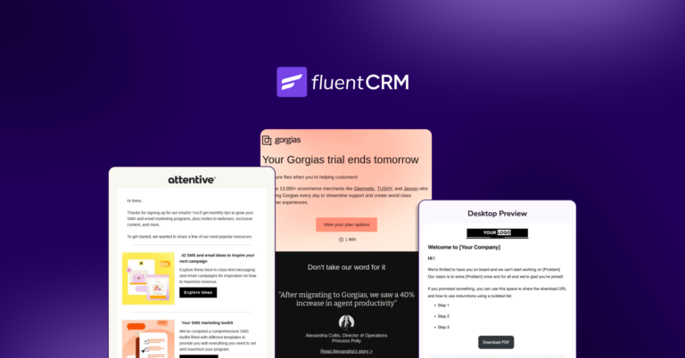
Expert Endorsement Lead Capture Page
Scenario: A SaaS company highlights expert recommendations and user trust signals to encourage visitors to try the product or download a resource.
In markets where buyers compare multiple tools, credibility often determines whether a visitor takes the first step. An expert endorsement capture page focuses on visible validation before asking for an email or trial signup.
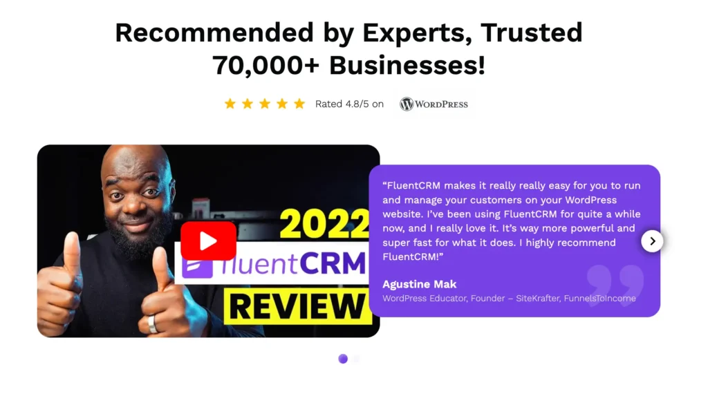
Instead of beginning with a feature list, the page leads with strong trust indicators: industry experts, recognizable educators, user numbers, ratings, or video testimonials. When visitors immediately see that respected professionals recommend the product, skepticism decreases, and curiosity increases.
A strong implementation combines three elements of proof:
- Expert recommendation or testimonial
- Large-scale adoption metrics (users, businesses, downloads)
- Visible rating or performance indicators
For example, a headline like:
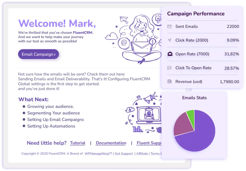
Email Marketing Automation Inside WordPress, Without Limits!
followed by a short product showcase, signals credibility instantly. This sequence mirrors how real buyers evaluate software: first, trust the source, then evaluate the decision.
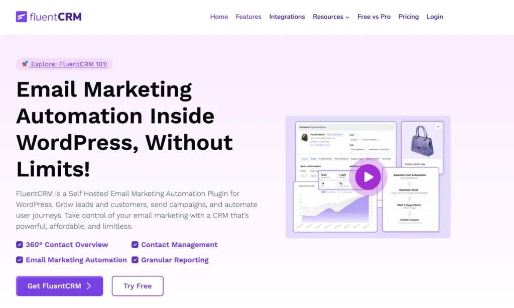
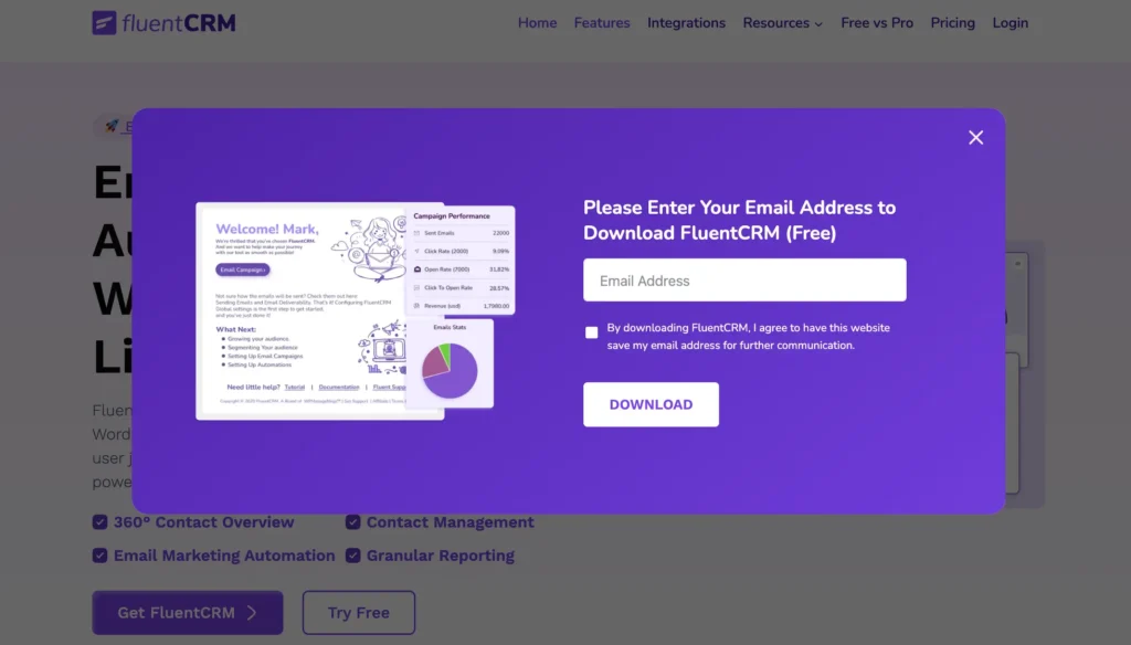
When the visitor clicks the ‘Try Free’ button, it leads the user to this page
Why It Converts
This approach works because it removes uncertainty early in the decision process. When respected educators, creators, or industry practitioners publicly recommend a product, visitors interpret the signal as third-party validation.
Large adoption numbers reinforce that validation through social scale, while ratings provide quick quality cues. Together, these signals reduce perceived risk and make the opt-in feel safer.
Instead of asking visitors to believe marketing claims, the page shows that others have already evaluated the product and found it valuable.
Where Friction Appears
Usually, friction emerges when credibility signals feel vague or unsupported. Generic claims such as “trusted by thousands” weaken the effect when no numbers, names, or evidence appear.
Another breakdown occurs when testimonials are disconnected from the offer. If visitors see strong praise but cannot clearly understand what they will receive after signing up, momentum slows.
Expert-driven capture pages work best when trust signals lead naturally into a clear next step. When credibility, clarity, and value appear in the right sequence, visitors move from interest to action with far less hesitation.
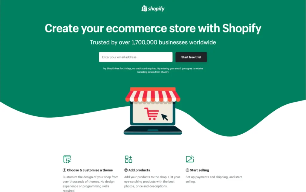
SaaS Lead Capture Landing Page Example
In SaaS environments, buyers are not just looking for theory. They are looking for implementation shortcuts. A template signals speed, structure, and immediate usability.
A high-performing version of this page typically includes a clear pain-focused headline, a specific and tangible downloadable asset, minimal form fields, and a single, focused call to action. The messaging emphasizes execution rather than abstract education.
Why It Converts
SaaS buyers prioritize efficiency. A ready-made template reduces setup time, lowers complexity, and provides clarity on where to begin. The perceived value is practical, not theoretical. When the outcome feels directly implementable, the exchange feels logical.
The simplicity of the form also supports conversion. Fewer fields reduce cognitive effort and increase completion rates. A single CTA keeps the decision focused.
Where Friction Appears
Friction typically arises when qualification is introduced too early. Asking for company size, budget, or detailed information before delivering value increases resistance. Similarly, placing demo requests near the opt-in can shift the psychological framing from “resource download” to “sales conversation,” which may not match the visitor’s intent.
Redirecting users to a generic homepage after submission also disrupts continuity. A dedicated thank-you page that reinforces the asset and introduces the next logical step maintains progression.
eCommerce Lead Capture Landing Page
In eCommerce, timing drives behavior. Visitors are often already browsing products, comparing prices, or evaluating options. A percentage discount introduces an immediate and tangible incentive that supports purchase momentum rather than interrupting it.
The structure is simple because the decision is simple.
Why It Converts
The value is immediate and transactional. Visitors understand exactly what they receive and how it benefits them. The exchange feels fair: an email address for instant savings.
Low effort reinforces action. One field reduces friction. A clear reward removes ambiguity. When incentive and simplicity combine, hesitation decreases.
Where Friction Appears
Friction typically arises when delivery is delayed. If the discount code does not appear instantly or arrives late via email, momentum weakens. Generic messaging that fails to reinforce urgency can also reduce effectiveness.
Another common breakdown occurs when there is no clear confirmation. Without visible acknowledgment, either on-page or via email, trust declines, and purchase intent can drop.
Pro-Tip: If you are running a ecommerce business, you need to tweak your plan and landing pages according to eccomerce email marketing guidelines. You can check out this guide for this.
Webinar Registration Lead Capture Landing Page
Scenario: A business educator offers a live funnel-building masterclass to generate leads and warm prospects.
In educational funnels, visitors are not just seeking information. They are seeking skill development and measurable progress. A masterclass works when it promises transformation within a defined structure and timeframe.
A strong implementation highlights a clear transformation promise, specifies the date and expected outcome, reinforces instructor credibility, and supports registration with a structured reminder sequence. The positioning should communicate what participants will be able to do after the session, not just what will be discussed.
Why It Converts
The appeal lies in skill acquisition with a defined result. The value feels concrete because the outcome is practical and time-bound. When the promise is specific and the instructor’s credibility is visible, the commitment feels worthwhile.
Reminder sequences further strengthen conversion by reducing no-show rates and maintaining anticipation between signup and event.
Where Friction Appears
Friction often begins with overly long registration forms. Educational interest does not automatically translate into willingness to share extensive personal information.
Vague outcomes also weaken motivation. If the benefit is unclear or abstract, urgency declines. Overwhelming copy can further reduce clarity by burying the transformation beneath excessive explanation.
In educational funnels, clarity drives action more than persuasion. When the outcome is specific, the timeline is defined, and the path feels structured, commitment follows naturally.
B2B Service Lead Capture Landing Page
In B2B environments, buyers evaluate expertise before engaging in conversation. A funnel audit works when it feels structured, professional, and outcome-oriented, not like a disguised sales pitch.
A strong implementation clearly defines the deliverable, sets expectations about what will be reviewed, positions the agency with visible authority, and frames the offer as low-risk. The visitor should understand exactly what they will receive and what happens after submission.
Why It Converts
This type of offer converts because it reframes the interaction from promotion to diagnosis.
Instead of asking prospects to immediately trust a service or commit to a purchase, the page offers a structured evaluation of their current funnel performance. That shift in positioning matters. Buyers feel they are gaining insight rather than being pushed toward a sale.
When credibility signals, such as proven frameworks, measurable outcomes, or examples of past improvements, appear alongside the offer, the audit becomes even more compelling.
Visitors see not only that the agency can analyze funnels, but that it has a repeatable process for identifying and solving performance gaps.
Where Friction Appears
Friction often arises when the form requires excessive detail before trust is established. Long qualification fields can feel premature at the awareness stage.
Unclear next steps also create uncertainty. If visitors do not understand whether they will receive a report, a call invitation, or both, confidence declines. A lack of visible proof, such as results, testimonials, or examples, further weakens perceived legitimacy.
In agency funnels, specificity and transparency sustain momentum. When expectations are clear, and trust is visible, prospects move from curiosity to conversation with confidence.
Lead Capture Landing Page Mistakes You Should Avoid
Even the most visually polished lead capture pages can fail when the strategy behind them is unclear. Conversion is rarely about aesthetics alone; it’s about guiding visitors through a structured path that feels logical, relevant, and low-friction.
Common breakdown points that sabotage capture include:
- Too many form fields: Each additional field adds friction. Even interested visitors hesitate when asked for excessive information. Simplicity drives higher completion rates.
- Weak or generic headlines: Headlines that fail to identify a specific pain point or promise a tangible outcome struggle to grab attention. Visitors must immediately understand why the page matters to them.
- No immediate follow-up: Without timely confirmation or next steps, interest fades. Leads that feel ignored rarely return.
- Asking for commitment before delivering value: Pushing for demos, trials, or purchases before establishing relevance creates skepticism and abandonment.
- Sending traffic to non-purpose-built pages: Homepage, product pages, or generic content pages scatter attention and dilute conversion potential. Focused landing pages outperform generalized ones.
- Overloading with copy or visuals: Too many competing messages create cognitive overload. Clarity wins over creativity when the goal is a single action.
- Misaligned traffic sources: Sending paid or organic traffic to pages that don’t match intent leads to frustration and low engagement. Every traffic source should have a corresponding landing page optimized for that audience.
- Ignoring behavioral signals: Without tracking engagement, teams cannot adapt messaging, email sequence follow-ups, or measure readiness. Every interaction is data that should inform the next step.
Each of these breakdowns reduces the visitor’s willingness to take even a small action, the micro-commitment that sets up further engagement. Lead capture is not a one-off transaction; it’s the first step in a larger progression system.
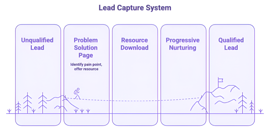
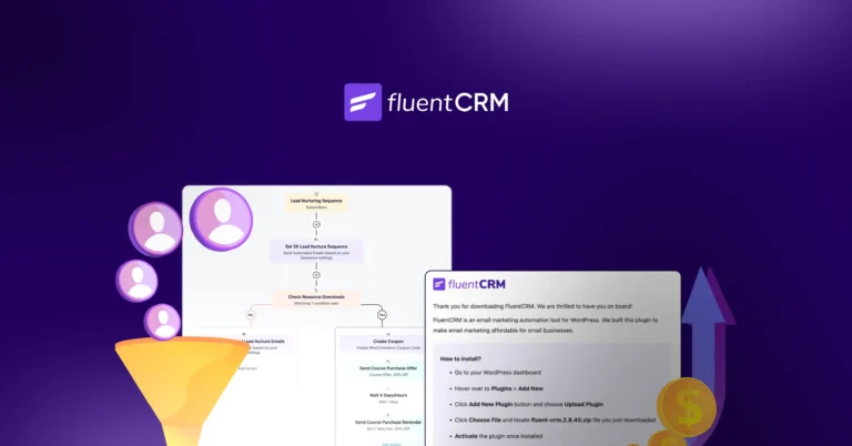
How A Simple Lead Capture System Works Efficiently
A strong lead capture system does more than collect emails; it starts a guided journey. The goal is not just to fill the pipeline, but to move leads forward through awareness, evaluation, and readiness.
A typical structured system looks like this:
- Lead lands on a Problem Solution Page: The page identifies a pain point and presents a clear, valuable resource. This first step earns the visitor’s initial yes.
- Lead downloads the resource and receives confirmation: Immediate delivery ensures trust and sets expectations for the next interaction.
- Progressive nurturing based on behavior: Here, at least these three reaction is possible:
- If the lead engages with advanced content, they begin receiving evaluation-focused emails that help compare solutions.
- If they explore pricing pages or feature comparisons, use-case content and workflows guide them further.
- If the lead becomes inactive, automated reengagement emails bring them back into the journey.
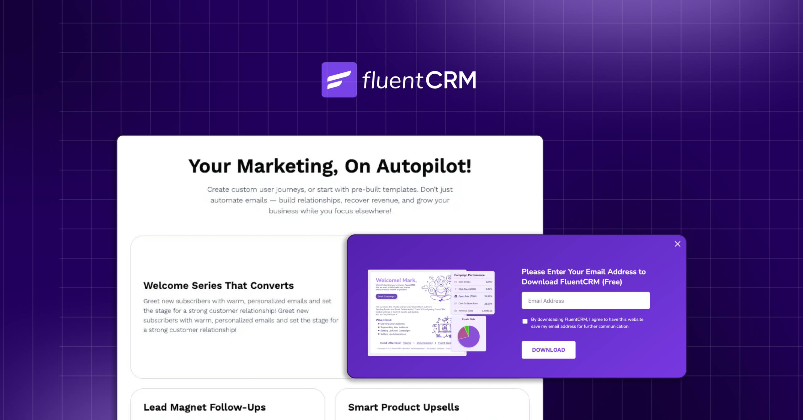
- Automation, segmentation, and tagging: Systems like FluentCRM allow marketers to combine behavioral email marketing, contextual segmentation, and triggered follow-ups to support a smooth progression. Every interaction, from downloads to page visits, feeds into a nurturing workflow that adapts to the lead’s stage and intent.
Why This Works?
- Clarity and relevance: Each message matches the lead’s current understanding and readiness.
- Behavior-driven progress: Nurturing responds to engagement, not a fixed schedule.
- Confidence-building: Leads move step by step, reducing uncertainty and naturally increasing readiness.
- Sustainable growth: Instead of constantly chasing new leads, the system develops value from existing contacts, turning interest into real opportunities.
Most teams struggle not because leads are missing, but because there is no clear nurturing process. Contacts download resources, attend webinars, and join newsletters—but without a structured framework, curiosity rarely converts into decision-making.
Pro-Tip: For actionable insights on implementing these systems, see this guide on Lead Nurturing Process.
Lead Capture Only Works When It Complements a System
Traffic is only the beginning. A landing page earns attention, but real growth begins with what happens after the click.
The best lead capture pages do more than collect email addresses. They remove friction, communicate value instantly, and trigger a thoughtful journey through automated follow-ups. Without nurture, captured leads simply sit idle.
Instead of endlessly chasing more visitors, focus on what happens to the ones already arriving. When every captured lead enters a structured path of relevance and value, a simple landing page becomes something far more powerful, an engine that quietly turns curiosity into commitment and attention into lasting growth.
Samira Farzana
Once set out on literary voyages, I now explore the complexities of content creation. What remains constant? A fascination with unraveling the “why” and “how,” and a knack for finding joy in quiet exploration, with a book as my guide- But when it’s not a book, it’s films and anime.
Table of Content
Related Articles and Topics
-
7 High-Impact Lead Nurturing Email Templates with Real Life Examples that Successful Brands Use
Lead nurturing is often reduced to a swipe file of email templates. Pick one, paste…
-
Lead Nurturing Process: How Successful Businesses Turn Leads Into Customers With Structured Nurturing
Lead generation fills the pipeline. Lead nurturing moves people through it. Many teams generate steady…