A Peak Into WordPress 6.2 “Dolphy”
WordPress 6.2 “Dolphy” was released just a few days back. Named after the famous jazz musician Eric Dolphy, the new WordPress experience is a treat to both eyes and brains —just like his music is a treat to our ears!
The release is the most buzzing news in the community lately with many exciting new features and significant improvements, strongly emphasizing the block editor and site editing. It includes updates to media and widget handling as well.
Altogether, these new features will make creating and managing a website easier than ever. But how can you make the most of the new version if you are not familiar with it?
That’s why we have highlighted the top features of WordPress 6.2 in this blog. Keep reading to find out what’s new and start making the most of WordPress 6.2.
Let’s begin!
Major WordPress 6.2 features
Given how massive of an update WordPress 6.2 is, it’s no wonder that this update came with tons of features. Among all those, these are some significant features you’d want to get familiar with:
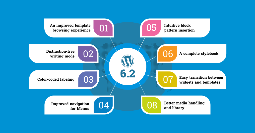
An improved template browsing experience
Once you click on Appearance, you’ll notice that the site editor is no longer labeled as beta.
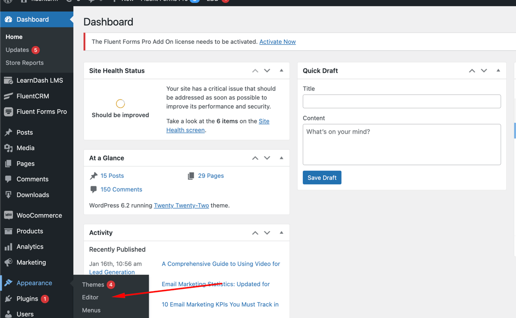
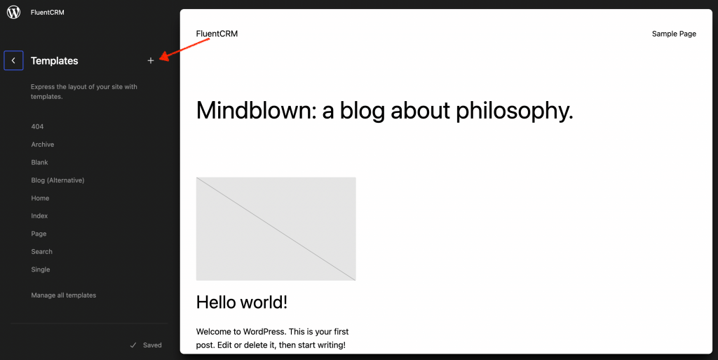
The most significant change is that you’ll now be directed to the Template and Template Parts selector upon landing. In contrast, previously, you would have entered directly into the Home page template edit mode.
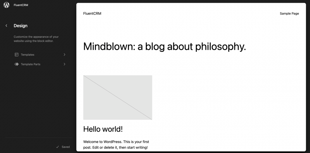
To edit, you can either choose Edit from the top of the left panel or navigate through the Templates and Template Parts that you wish to modify. And by clicking on the (+) icon, you can add a new template.
Distraction-free writing mode
We all are familiar with the struggle of writing elsewhere and then pasting it on WordPress. And the distraction-free writing mode might put an end to it as it makes writing on WordPress more efficient than ever. Click on the three dots beside settings to enable the distraction-free mode.
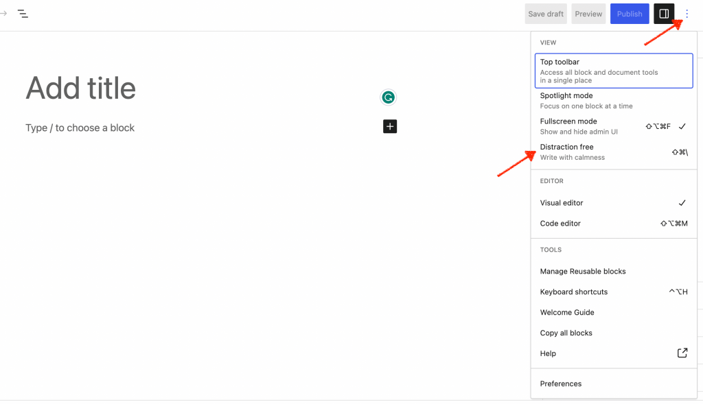
Enabling this mode will conceal all editor control elements and reduce the visibility of toolbars to concentrate your attention solely on the content.
Color-coded labeling
You might find it tough to remember your specific adjustments once you navigate the site after a certain time. That’s where WordPress 6.2’s color-coded labels feature comes in. It will greatly assist you in spotting and eliminating any unwanted changes.
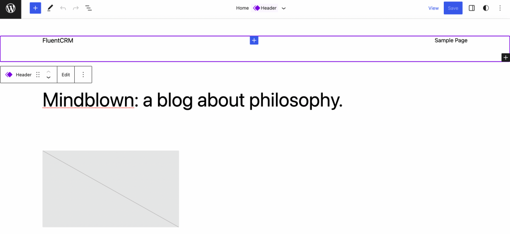
Colorization and consideration are applicable for:
- List view (active states, resting, hover )
- Header/footer
- Canvas (outlines / overlays in select mode)
- Block Toolbar
- Inserter (block icon)
- Inspector
Improved navigation for Menu
One of the main focuses of this release was to enhance the menu navigation feature. While it required users to use the full site editor previously to add navigation menus, this update has added a subpanel under the navigation block to simplify the process.
Now users can easily create, edit, or even remove menu items effortlessly from the navigation block. To access this feature, click on Appearance and go to Editor. Click on the Header template to edit and choose the Navigation block.
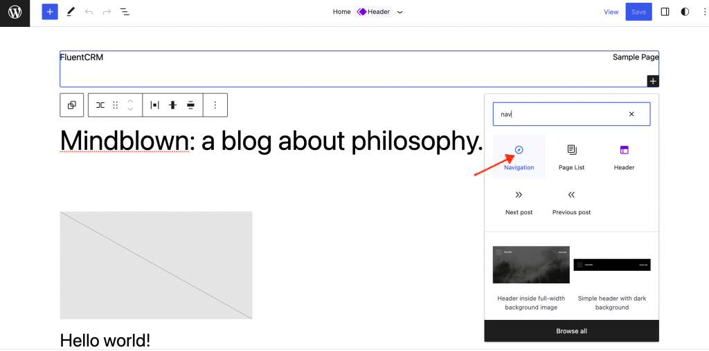
Now click the Add block (+) icon to set up the menu items. It is customizable with either page links or custom links.
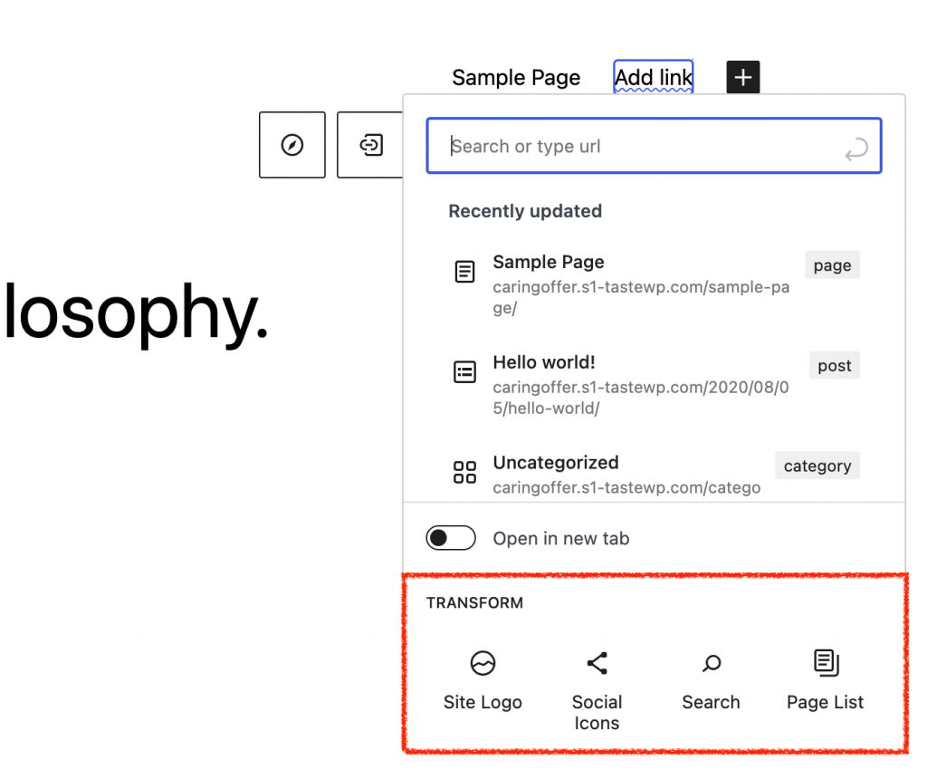
You can even add multiple menus and rearrange or edit the menu items easily by clicking on the three dots on the right side.
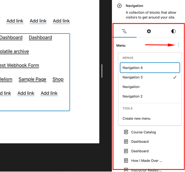
Intuitive block pattern insertion
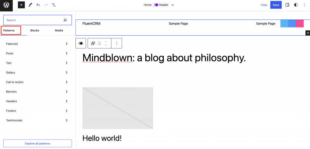
WordPress block patterns are a library of ready-made graphical building blocks that can be arranged in any way you like to showcase the content exactly you want. And in this new version of WordPress, you’ll get all the patterns and more listed in one section.
Click on the plus icon on top and click on Patterns. If you choose any pattern now, you’ll get to see a preview in WordPress 6.2!
A complete style book
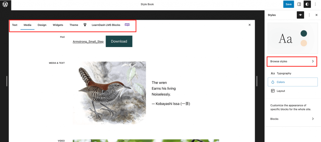
The style book is one of the most fascinating additions to WordPress 6.2. Now you can experiment with styles before finalizing. As a result, you’ll better understand what block styling or customization will suit your requirements best.
Click on Styles> Style Book as shown in the picture below.
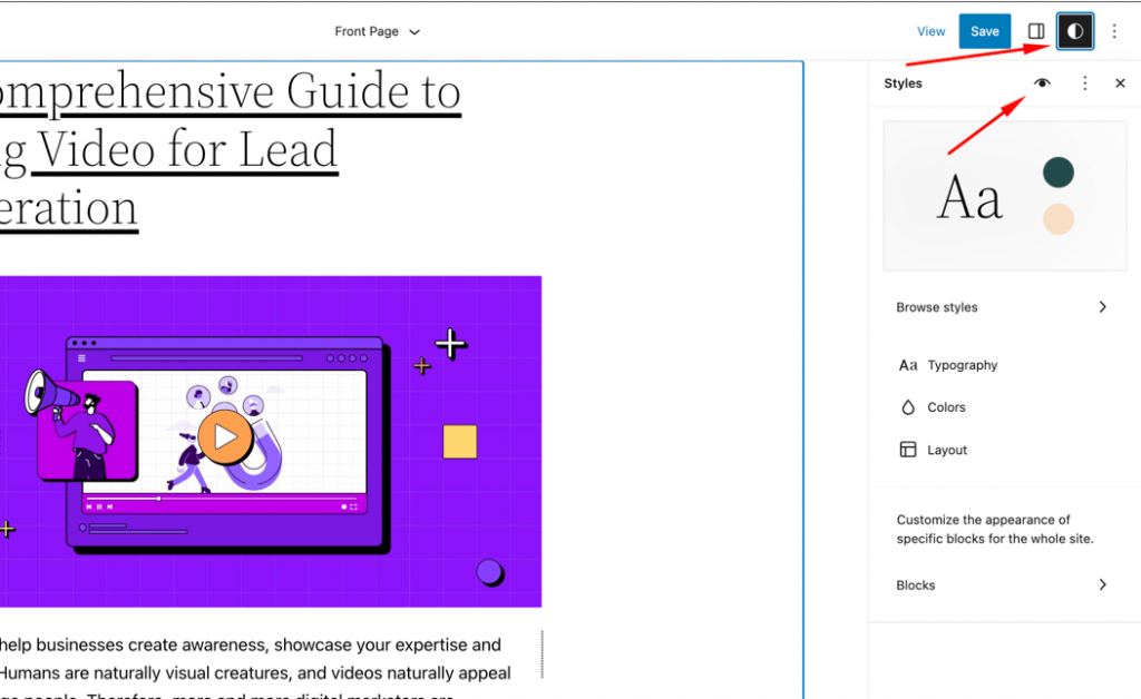
By clicking on Browse style, you can see which color arrangement is the best for you. There are separate sections to play with each element of your website, like text, themes, widgets, design, etc.
Easy transition between widgets and templates
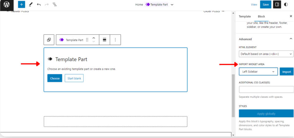
WordPress 6.2 has brought back the solution of losing legacy widgets for the users who switch to block themes from classic widget themes. Now, users can import those as template parts.
To do that, create a template part by clicking on the (+) add new block button. Then you can access the option to import a widget area by expanding the Advanced tab.
Better media library and easier media handling
Though handling and uploading media files to WordPress has always been easy, WordPress has taken its intuitiveness to a whole new level by dedicating a complete section for media.
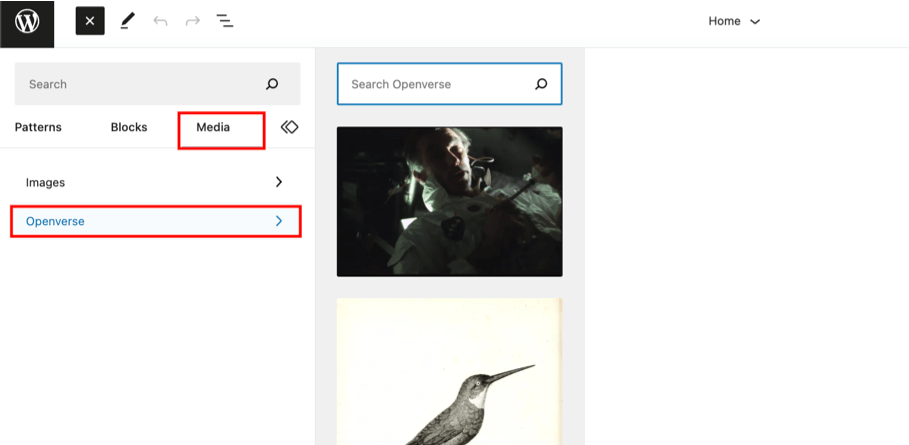
Not only that, the new integration will Openverse, a source of free photos, has made millions of photos easily accessible. To access,
- Navigate to Page/Post -> Add New
- Click the block inserter
- Choose the new “Media” tab
- Select the Openverse option
- Scroll or search for your desired media files
- Select the file you want to insert into the post
Additional WordPress 6.2 features
Now that you are familiar with this new release’s groundbreaking features, we bet you can’t wait to try those out yourself. But here’s another bet! You might as well learn about the additional features as they might come in handy for you.
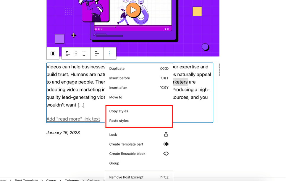
Copy or paste block style
Up until now, it wasn’t possible to copy and apply the same style to another block. But that ends with WordPress 6.2. From now on, you can easily copy and paste styles and save yourself from the trouble of duplicating a block to copy the styles.
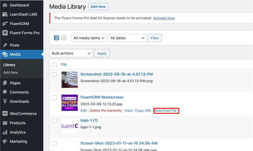
Download link for media files
Downloading the media files from your WordPress dashboard just got easier. Simply click on media, and you’ll get an option to download the files in list views.
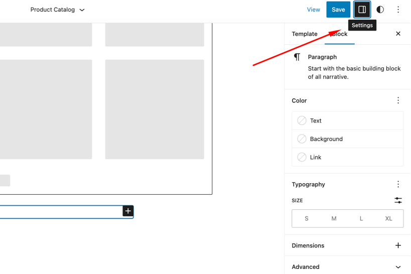
Block settings got a new icon
Not so groundbreaking, but in case you wonder where in the world the block Settings option went —it didn’t disappear, it just got a brand-new icon!
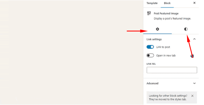
And the helpful news is that block settings and styles are now divided into sub-panels.
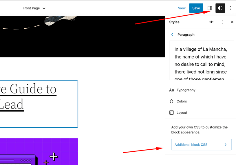
Custom CSS
Now you can easily enter custom CSS for the full site or a specific block. To add custom CSS for the whole site, click on Styles, and then the three dots beside the Stylebook.

If you want to add custom CSS to a certain block, go to Styles and click on Blocks. Once you have selected the block, click on Additional block CSS and add the CSS you want to.
Caption button added to the image block toolbar
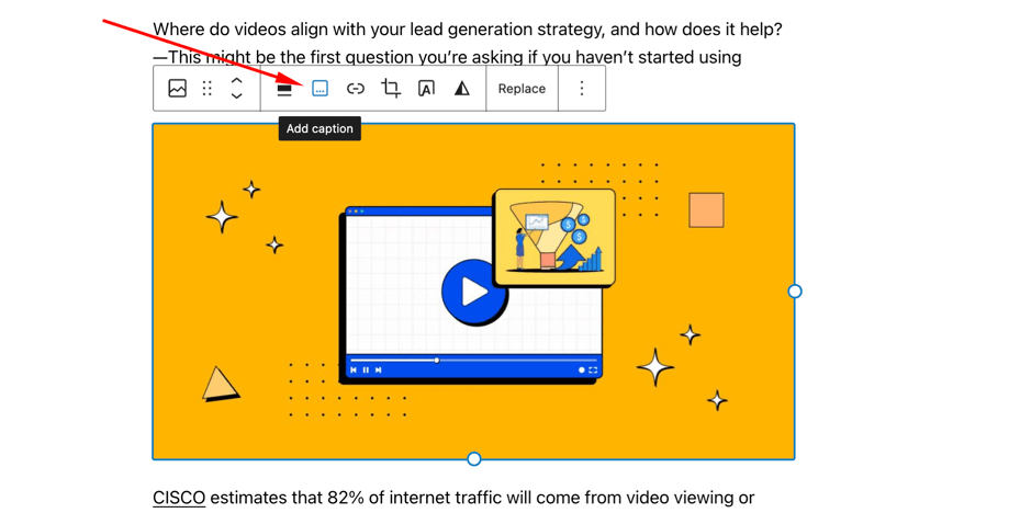
If not often, you have at least written a few lines in the caption area as WordPress automatically adds the caption area below the image and moves the cursor there. You won’t have to run into that problem ever again as that has been removed. Instead, a caption button has been added to the image block toolbar.
How our ninjas contributed to the WordPress core
Just like Rome wasn’t built in a day, all these features, fixes, and improvements to WordPress did not happen overnight. This latest release of WordPress is undoubtedly a result of hours of work by thousands of developers worldwide.
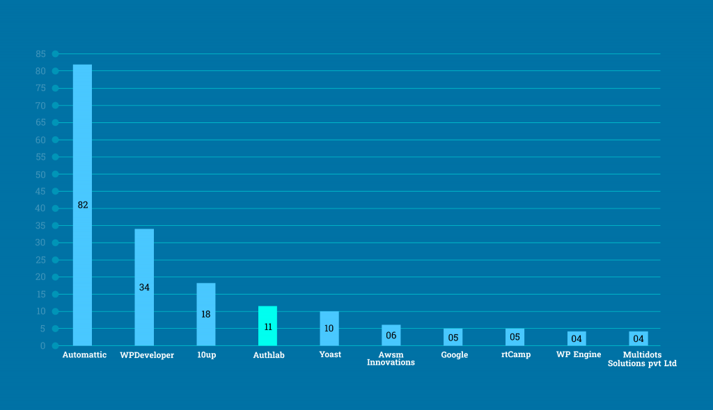
Starting from WordPress 5.9 release, our developers have been actively contributing to the core. Starting with 2 core contributors in the 5.9 release, the number has increased to 11 in the latest release. That takes us to the #4 position as contributors by company.

Our team has been contributing beyond their work hours and we could be happier to see them listed as core contributors. We hope to continue contributing to WordPress and make this open-source platform a heaven for the users!
Try Our Free Marketing Automation Plugin for WordPress!

Wrapping up
WordPress 6.2 is another leap towards making website building easier and beginner friendly for new users. This release will surely ensure a better WordPress experience and help you navigate things easily.
Don’t forget to let us know which of the new features you find most useful and if there’s anything you would expect in the next update of WordPress.
Cheers!
Editorial Panel
Content Writer
FluentCRM Editorial Panel is a group of content writers experienced with digital tools, marketing, and business trends.


Leave a Reply