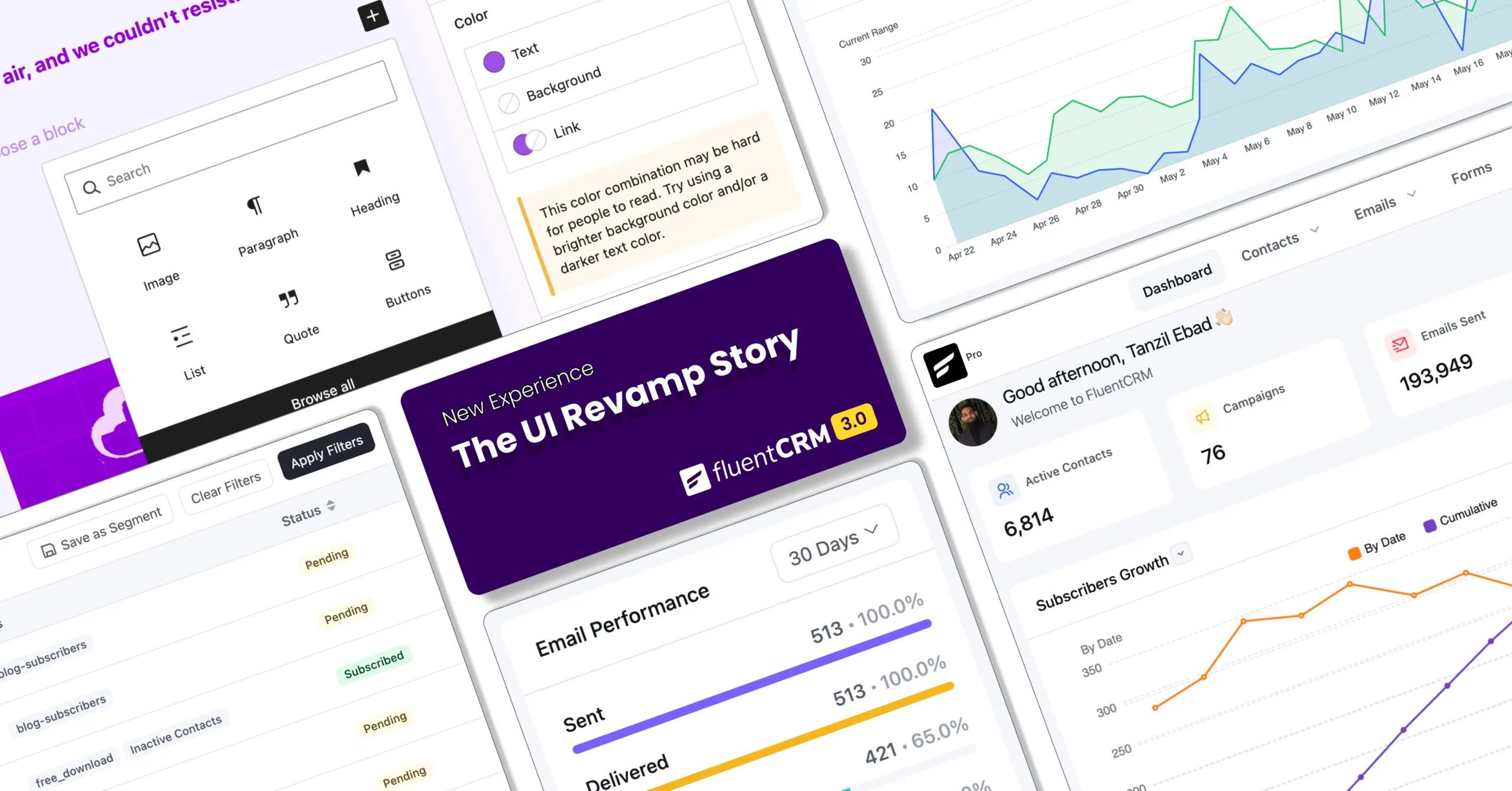
UI Revamp Story: The Philosophy Behind FluentCRM 3.0

Summarize with


Last Updated:
Five years ago, FluentCRM’s interface made complete sense.
The product was young, simple, and the design reflected that.
Users were happy. FluentCRM was growing. Everything was working fine.
But fine has a shelf life.
We know, products grow, and with that, expectations shift. What felt clean and modern in 2020 starts quietly working against you by 2025!
So, the team looked at what they had built and asked a harder question: “Is this ready for where we’re going as a whole?”
The answer was uncomfortable. And this is what made us reach where we are today.
Today, we will share the unfiltered story of what our UI team’s philosophy was while designing new FluentCRM.
The Wake-Up Call: What the Team Saw That Users Didn’t
Nobody asked for a redesign.
Not the users. Not the community. Nobody was filing tickets about how the interface looked. FluentCRM was working, and everyone knew it.
The push came from within, from the team looking at their own product every day and feeling a growing tension between what FluentCRM was and what it needed to become.
Five separate things were pulling at them. And together, they made the case impossible to ignore.
Flawed Usability
Nobody was shouting about it. But the team didn’t need complaints to see what was happening.
- New users were taking longer than they should to find their footing
- Simple tasks had more steps than necessary
- The interface wasn’t broken; it just wasn’t as easy as it could be
For a tool built to simplify email marketing workflows, that was a contradiction the team couldn’t ignore.
Usability isn’t something users articulate. They just leave, or they stay frustrated without knowing exactly why. The team knew. And that was enough.
Aged Out Design System
FluentCRM was built more than five years ago. At the time, the design made complete sense.
But product design doesn’t stand still; patterns evolve, standards shift, and what felt modern in 2020 starts to feel outdated by 2025.
The product’s visual language hadn’t kept up with where the industry had moved. It wasn’t ugly. It was just behind. And building new features on top of an outdated design system meant every improvement came with a hidden cost.
Components Inconsistency
We have added many features and made many improvements, and to do that, we had to add various components to the existing system.
These components were added without a strict ruleset; collectively, it created an interface that felt assembled rather than designed.
The team had been living with this long enough. V3 was the moment to fix it properly and bring them under a set of rules.
Redundant Internal Flows
Growing fast is a good problem to have. But it comes with a natural side effect. Things get cluttered.
The flows built over the years worked, but some were unnecessarily complex; some steps could be fewer.
It wasn’t a problem, it was an opportunity. V3 gave the team the chance to revisit those flows and make them feel as good as the rest of the product.
The Ecosystem Needed to Speak One Language
This one was bigger than FluentCRM alone.
Fluent Forms, Fluent Booking, FluentCart, FluentCommunity, and more had already built something worth protecting: a shared design system that made moving between products feel natural.
The goal is that when users jump from one Fluent product to another, it should serve these three purposes:
- They shouldn’t feel lost
- The layout must feel familiar
- The visual language should feel consistent
FluentCRM, however, hadn’t fully caught up to that standard until V3.
And for a product sitting at the center of so many users’ workflows, that gap needed to be closed.
V3 was the team’s commitment to bringing FluentCRM fully into the fold so that whether someone opens Fluent Forms or FluentCRM, it feels like home.
A Simple Philosophy: Clarity. Consistency. Usability.
Before a single screen was redesigned, the team aligned on a philosophy.
If the new FluentCRM UI had to be described in three words, those words would be: Clarity. Consistency. Usability.
Simple words. But each one carried real weight in how decisions got made.
Clarity
For us, clarity means reducing cognitive load.
We wanted to make FluentCRM easier for users to scan a screen and immediately find what they needed.
This led to a deliberate shift in how secondary actions were handled. Such as Filters, for example, moved from being explicitly visible at all times within contacts to appearing contextually. It’s still within the contact dashboards, but now you can view it when you need it.
The goal was to surface primary elements first and let focus on the secondary element.
Consistency
The team adopted a strict 4-point grid system applied across the entire interface; predictable spacing, precise alignment, and a visual rhythm that makes the product feel intentional rather than assembled.
A restrained color palette reinforced that discipline. When every element follows the same rules, the whole product starts to feel coherent, not cobbled together.
Usability
Usability shaped how the team thought about change itself.
Our team made a deliberate decision early on: we would improve the visual language of FluentCRM without touching the information architecture.
The layout would stay familiar. The navigation logic wouldn’t be moved around.
Because the worst thing we could do to a user who had spent years inside the product was make them feel lost on day one of V3!
The learning curve had to be ZERO.
What We Changed?
Talking about why we rebuilt FluentCRM is one thing. Seeing what actually came out of it is another. Here’s a look at the key areas that got a meaningful upgrade in V3, not just visually, but in how they work and feel to use every day.
Reimagined Dashboard & Report
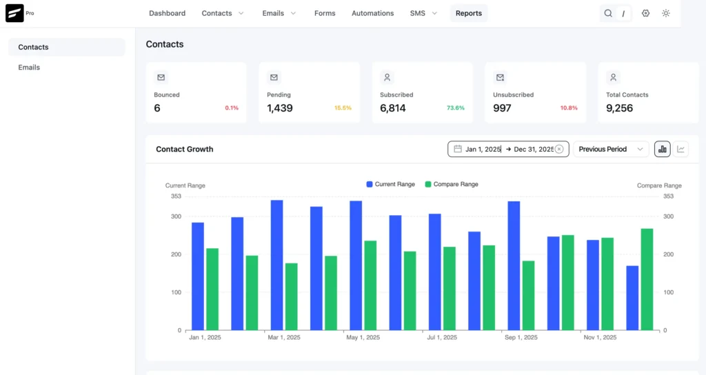
The dashboard was one of the first things users see when they open FluentCRM, so it had to set the right tone. In V3, it’s been completely rethought.
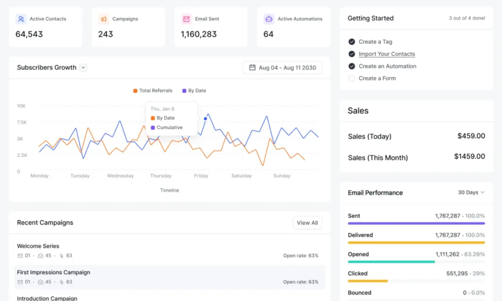
The reporting layout is cleaner, and the data is easier to read at a glance. You open it, and you immediately know where things stand.
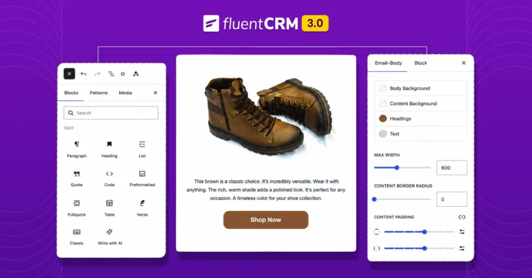
WordPress-Native Email Builder
Built on the Gutenberg editor, the experience is smoother, the interface is more intuitive, and creating campaigns no longer feels like switching into a different product entirely.
If you’ve ever built a page in WordPress, you’ll feel right at home here.
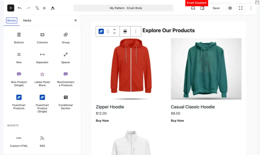
Beyond that familiar feel, the builder itself has been cleaned up significantly.
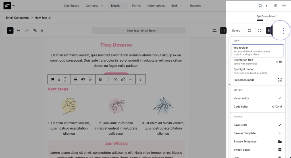
Email Settings are now grouped into a cleaner, more accessible workspace, so everything you need is easy to find without digging around. Additional controls live inside a tidier action menu, keeping the main canvas free from clutter.
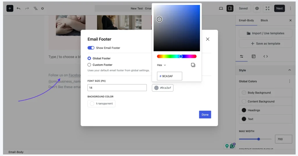
And, managing footer configurations is now as simple as clicking directly on the footer block.
Simplified Contact Management
Contact management in V3 is cleaner, faster, and a lot less cluttered.
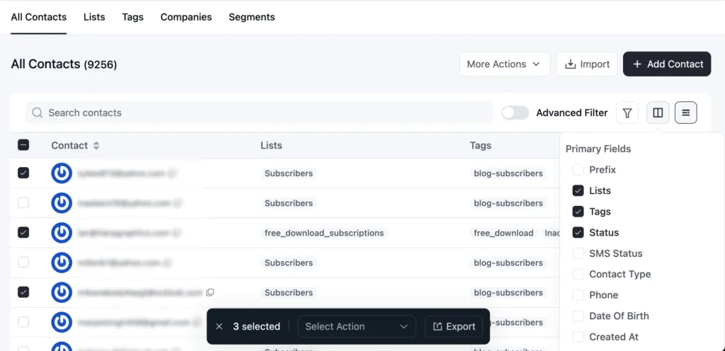
Filters are now tucked behind an icon, freeing up the screen so you can focus on your contacts without the noise.
Bulk actions have been brought front and center, making it easier to act on multiple contacts at once. And two new view formats (default and compact) let you choose between an enlarged and a collapsed view.
It’s the same powerful contact management, just without everything fighting for your attention.
Smart Campaign Management
Managing campaigns in the old version worked, but it wasn’t always elegant.
V3 brings a more structured, intuitive experience to campaign management, making it easier to find what you’re looking for and take action quickly.
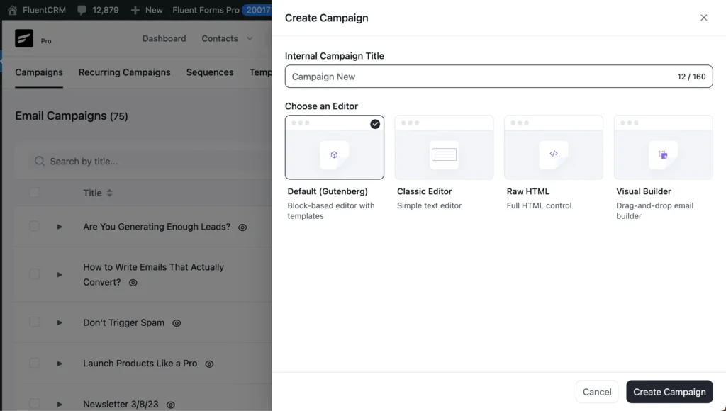
One of the most noticeable changes is how early the builder selection happens. Previously, users needed to go through the campaign creation process and then choose which builder to use.
Now that choice happens right at the beginning, so you’re never backtracking or second-guessing mid-way through.
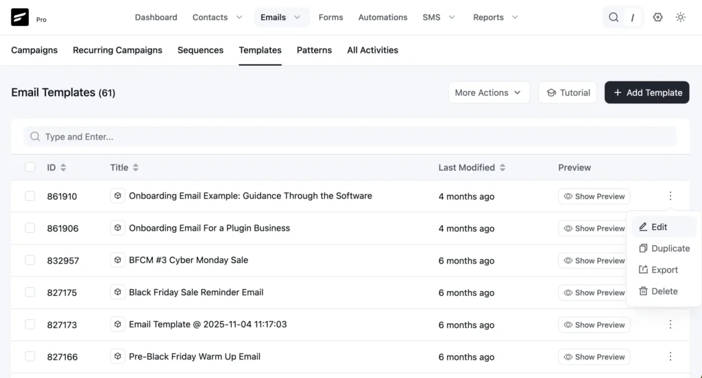
The email templates dashboard has also gotten smarter. There’s now a dedicated preview option that lets you view sent or drafted campaigns directly from the dashboard.
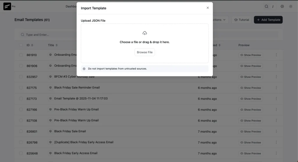
And importing email templates, which used to be a multi-step process, can now be done right from the template dashboard itself.
Refined Automation Action Selection
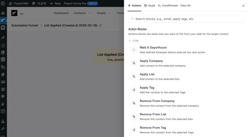
Previously, automation actions were displayed in a card-based layout, which meant a lot of scrolling just to find what you needed.
V3 switches to a clean list layout, making it significantly easier to scan through options and land on the right action quickly. It’s also been brought in line with the overall design system, so it no longer feels like a standalone screen doing its own thing.
Less scrolling, faster decisions, and an experience that finally feels consistent with the rest of the product.
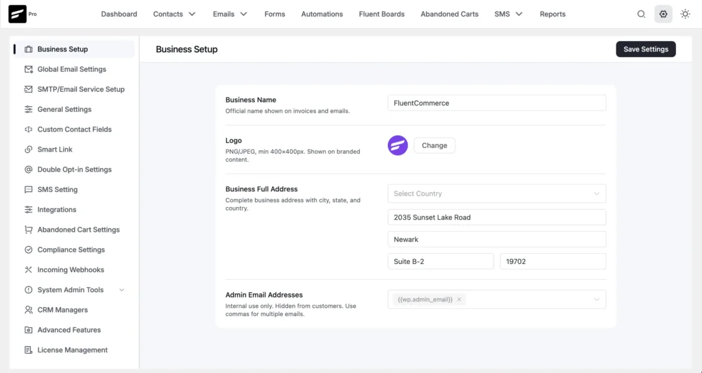
Smart Settings Module
Settings might be the least glamorous part of any product, but they matter more than most people realize.
In V3, the settings module has been redesigned to reflect the same layout and structure you’ll find across other Fluent ecosystem products.
If you’ve used Fluent Forms or FluentCart, it’ll feel instantly familiar. Same navigation pattern, same visual structure, same design system, just tailored to FluentCRM.
It’s a small change that makes a big difference, especially for users who move between Fluent products every day.
Where Things Got A Little Hard?
Knowing what you want to build and actually building it are two different things.
For the FluentCRM UI team, the hardest part wasn’t the vision; it was the constraints.
The Settings Dilemma
The settings module was one of the early battlegrounds.
The team had a clean idea: reorganize the settings into tightly grouped, collapsible modules. Nest everything logically. Make it shorter, smarter, and more structured. They designed a prototype.
And then, they stepped back and thought about the 80,000+ users already living inside the old settings.
These users would open V3 and find everything in a different place. The disorientation alone would be enough to turn a good design into a bad experience.
So the team pulled back.
Instead, the team improved the navigation within it and grouped only the modules where nesting seemed to be an obvious solution.
And, we must admit, it was the right call.
The Messiest Screens to Redesign (Email & Contacts)
Throughout the design process, the email and contacts sections were definitely the most complex to design.
These weren’t just complex screens; they were complex because they had grown complex over time.
- Multiple overlapping user flows.
- Scattered components.
- Navigation that had been added to rather than designed.
Getting these right meant untangling years of accumulated decisions, not just redesigning what was on the surface.
And all of this had to be done without breaking anything.
FluentCRM runs at the heart of thousands of businesses. Every automation built in 2021 needed to work exactly as before.
Backward compatibility doesn’t get celebrated, but it was one of the team’s most important commitments throughout the entire process.
What Beta Users Reshaped?
Every big product release has a moment of truth. For FluentCRM V3, that moment came when real users got their hands on it before it was ready for the world.
The team didn’t just run a beta to check for bugs. They ran it to listen.
And what came back wasn’t polished feedback from people trying to be nice. It was honest, unfiltered reactions from the people who actually use FluentCRM to run their businesses every day.
So, beta users were collaborators. Their fingerprints are on the final product, whether you notice it or not.
Here’s what their involvement actually changed:
- AI Compatibility: It was added entirely during beta. Users wanted it, the team moved fast, and it became a core part of V3.
- Minor UI Edits: Edits were made across multiple screens based on direct feedback from how users navigated the new interface in real time.
- Removed Ambiguity: Some users pushed back simply because the design felt unfamiliar. The team listened, separated the noise from the signal, and made adjustments where it genuinely mattered.
- Decision Making: Nothing was locked in until the team felt confident that real usage supported the decision.
What’s Still to Come?
V3 isn’t the final destination. The team is clear about that.
Here’s what the team is working on to ship in the coming releases:
Unified Campaign Creation Journey
The email module, despite being one of the most improved areas of the product, still has work ahead.
The goal is a fully unified campaign creation journey; one coherent flow rather than a series of connected steps that still carry traces of the old scattered structure. That work continues.
Modernized Automation Builder
Out of everything that was redesigned in V3, there’s one area that isn’t fully there yet: the automation.
While several parts of the automation section have already been shipped, the workflow creation still looks and feels like the old FluentCRM.
The UI team has already designed it. The work is done on their end, it’s been reviewed, and it’s waiting to be shipped.
Out of the entire V3 redesign, this is the last remaining piece.
And, it’s safe to say the automation workflow builder is going to be worth the wait.
V3 Was Never Just About the Look
V3 didn’t happen because someone woke up and decided FluentCRM needed to look different.
It happened because the team took a hard look at where the product was and realized the foundation wasn’t keeping up with where it was going.
The new interface is cleaner, more consistent, and finally feels like it belongs to the same family as the rest of the Fluent ecosystem.
And, most users will never notice the thing the team is most proud of.
It’s the migration from Vue 2 to Vue 3. It’s the upgrade that makes everything else possible.
- Faster builds
- Cleaner improvements
- Intuitive Design
- A codebase that no longer slows
Finally, V3 isn’t the finish line. It’s the starting point.
Tanzil Ebad Efti
Content Writer & Strategist
Words are my favorite playground. As a Creative Writer at WPManageNinja, I don’t just produce content; I tell stories. By mixing fiction and metaphors with real-life examples, I turn my writing into a creative journey that’s easy for readers to digest and relate to.
Table of Content
Related Articles and Topics
-
Meet FluentPlayer: The Interactive Video Plugin Built for WordPress
Most marketing automation funnels start with a signal. Someone submits a form, makes a purchase,…
-
New Gutenberg Editor: The Email Builder WordPress Users Always Wanted in FluentCRM
If you’re a WordPress user, isn’t it satisfying to write in Gutenberg? You click the…