


11 Real-Life Thank You Page Examples and Why They Work (2026)

Summarize with


Last Updated:
When you order pancakes, you naturally expect maple syrup and butter to come along, right? The way pancakes are incomplete without maple syrup, your service is incomplete without a thoughtful appreciation to your audience.
Just as maple syrup completes a stack of pancakes, a genuine appreciation completes your visitor’s experience every time they use your service. A thank you page or a confirmation page isn’t just a warm-up; it’s a powerful approach to boost conversion rates. Yet most brands waste the moment: 74% of thank-you pages carry zero secondary call to action.
You probably have ideas for your page, but reviewing examples can refine your vision.
Let’s dive in and get inspired!
What is a Thank You Page?
A thank you page, or confirmation page, is the page a visitor lands on right after completing an action such as a purchase, signup, or form submission. It confirms the action, thanks the visitor, and points them to a useful next step, making it the final step in conversion and the first step in retention.
Unlike confirmation emails, viewers don’t need to open these pages, even though they serve similar purposes. You can consider this page as the final step in the conversion process and the initial step in customer retention.
When to Use a Thank You Page?
Timing is the most important of all. Now timing in this case is pretty simple.
Whenever your clients take any actions such as: signing up, making a purchase, submitting a form, downloading content, or registering for an event, they deserve heartfelt gratitude.
Now, after your visitors has submitted the form, how do you confirm their action and guide them to the next step?
We have assembled some steps to help you redirect users to a custom thank you page.
Benefits of a Thank You Page
A well-crafted thank you page can have the same positive impact as a lead capture leading page. By appreciating your visitors, you increase the chance to leave a lasting impression on your visitors and eventually turn them into a loyal customer.
A few of those benefits are:
- Confirmation and Clarity: It provides transparency and reassures customers that their transaction was successful.
- Everlasting First Impression: A simple act of gratitude can produce a positive impression and encourage visitors to return.
- Gather Feedback: Use your page to invite customers to fill out a quick survey. Their insights can help you improve and grow.
- Upsell Opportunities: This page is a prime spot to suggest related products or services. Your customers are already in a buying mood, so showcasing something they might love will increase your upsell opportunities. Pair it with a welcome email to keep new subscribers engaged.
- Social Sharing: Encourage customers to connect with you on social media directly from the confirmation page. It’s free advertising and builds your brand’s online presence.
- Add Strong CTA: Add a personal touch, such as a discount code for their next purchase. It’s a small incentive that can turn one-time buyers into repeat customers.
11 Thank You Page Examples that Drive Engagement
Learning theory is good but without analyzing examples it can be tough to understand. So, we have assembled a few examples to learn from analyzing them.
Without further ado, let’s dive in!
FluentCRM
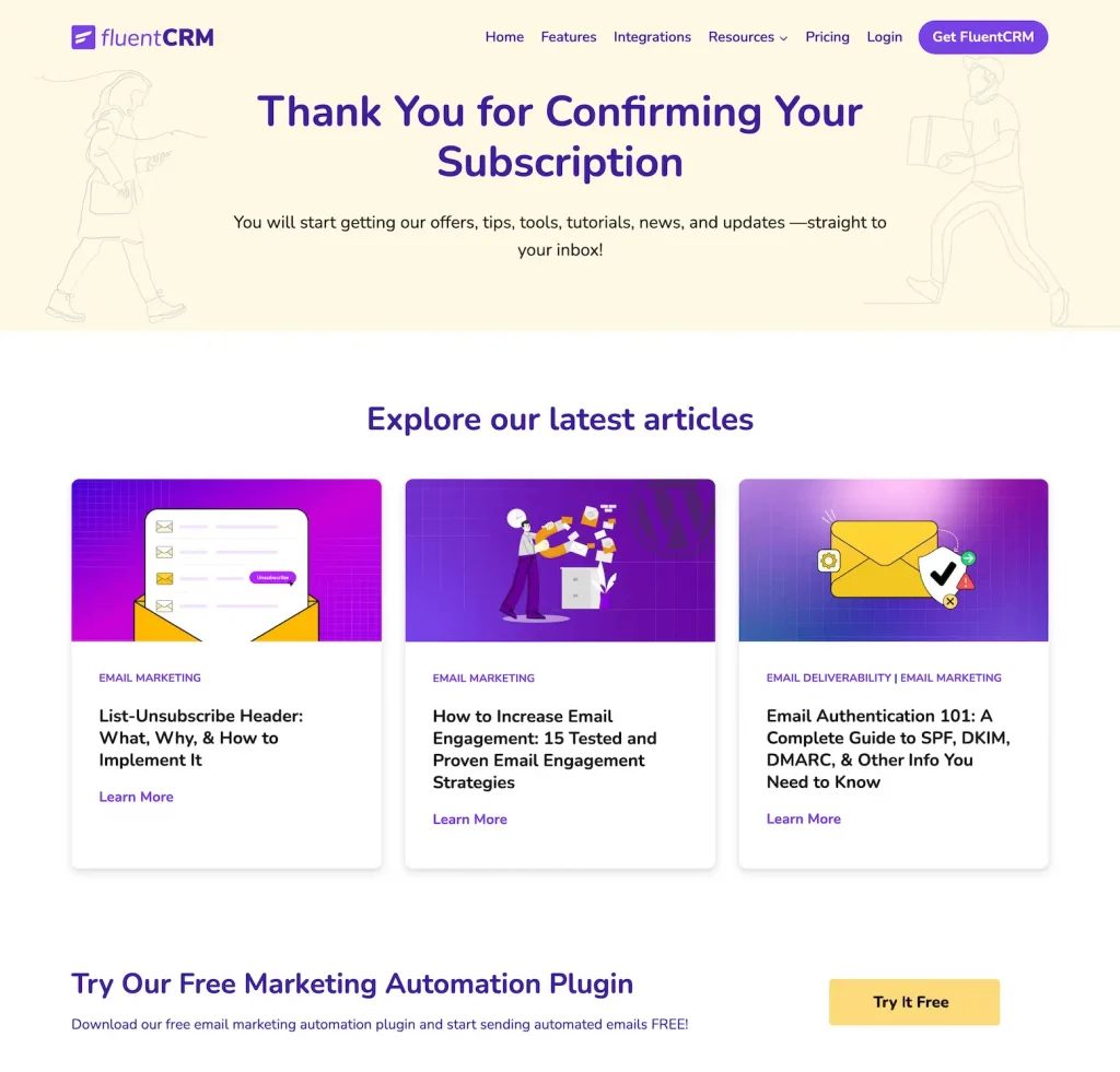
FluentCRM is a powerful self-hosted email marketing automation plugin for WordPress, integrating lead management, email campaigns, automation sequences, and user monitoring effortlessly within your WordPress dashboard.
Now, on their confirmation page, they confirmed the subscription with a very sweet thank you. They also guide their clients seamlessly to their latest blogs to keep them updated about FluentCRM.
Why it works: A warm, genuine thank-you paired with a clear next step (its latest blogs plus a free-trial nudge) keeps new subscribers moving instead of stalling.
Key Takeaways
- FluentCRM expressed their gratitude genuinely just like you would to your friends
- Highlighted their latest work – in this case, their latest blogs
- Asked their audience to try their product for free
- Transparently confirms subscribers will get newsletters, tutorials, and tips in their email
Mailmunch
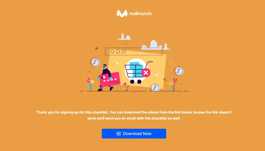
Mailmunch is a leading platform for growing email lists and engaging subscribers. On their page, they thank clients for signing up and provide clear instructions to get started.
Not just that, they promise to fix the link and email you if there’s an issue. Plus, they’ve included a convenient download button for easy access.
Why it works: One clean page with a single, highlighted download button removes all guesswork, though ending with no onward link leaves engagement on the table.
Key Takeaways
- Mailmunch created a visually appealing page with minimal elements
- Added a download now button and highlighted the button
- Didn’t direct their clients to any other links. As a result, their customer’s buyer journey ends here.
The New York Times
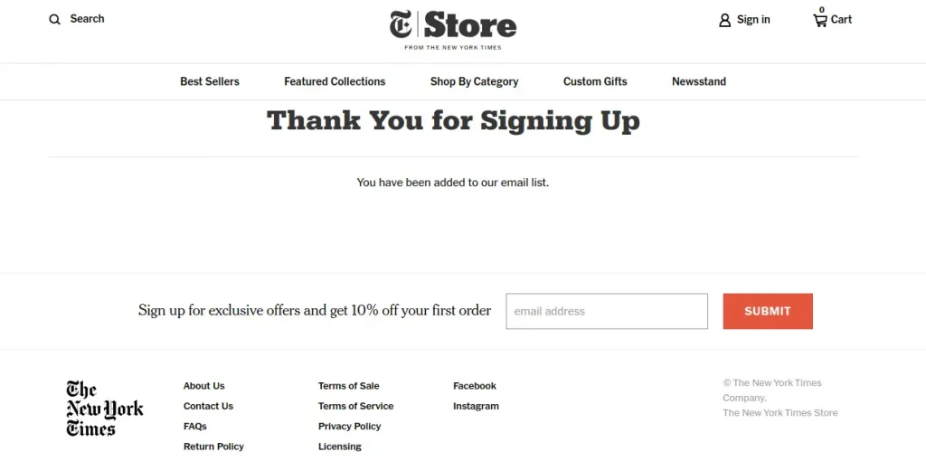
The New York Times is a renowned American newspaper known for its comprehensive and high-quality journalism. This page of The New York Times confirms clients’ requests with a direct appreciation saying ‘Thank you’. Not only that, they added a CTA with an offer of 10% off, on the client’s first order.
Why it works: A direct “thank you” plus a 10%-off first-order CTA turns a plain confirmation into a second conversion.
Key Takeaways
- The New York Times included options to learn more about their newspaper, just in one click
- Kept their newspaper’s typography consistent
- Added a sign-up or subscribe button with an additional incentive
Target
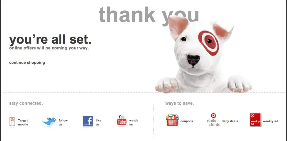
Target’s motto is- Don’t let customers go. You can see that right after confirming their client’s action with a Thank You pop-up behind the cute puppy with the Target logo, they add several social links for customers to stay connected. One thing Target nails at is their compelling visuals and emphasis on their logo.
Why it works: On-brand visuals and a row of social links keep customers connected instead of closing the tab.
Key Takeaways
- Target used light humor with their visuals to create a comfortable space
- Creatively presented their brand theme with minimal elements
- Focused on their brand motto with concise writing
- Added several options to connect to by customer’s preference
Marks & Spencer (M&S)
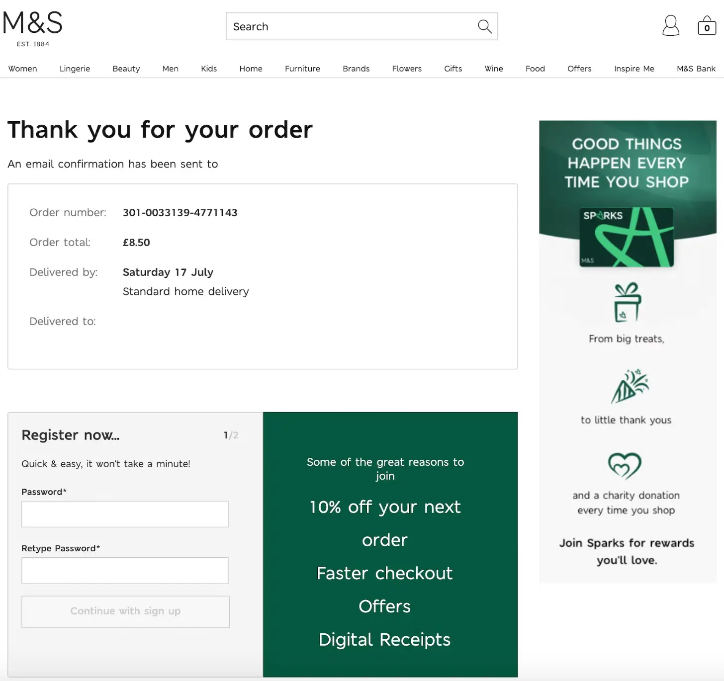
Marks & Spencer, often abbreviated as M&S, is a well-known British multinational retailer with a rich history and a diverse range of products. Their specialty lies not only in clothing but also in their marketing strategies.
Their order page assures customers with a thank-you message and promises a donation to charity with each purchase, which is a very unique initiative that sets them apart. Along with that, they maintained a great brand presence with properly organized elements.
Why it works: A reorder CTA and a charity-donation angle give the page both a next step and a reason to feel good about the purchase.
Key Takeaways
- Marks and Spencer, included a strong CTA to encourage reordering
- Provided an option for registration to enhance user engagement
- Maintained consistent brand colors throughout the page
- Added a social service element, such as a charity initiative, to stand out even more
Dribbble
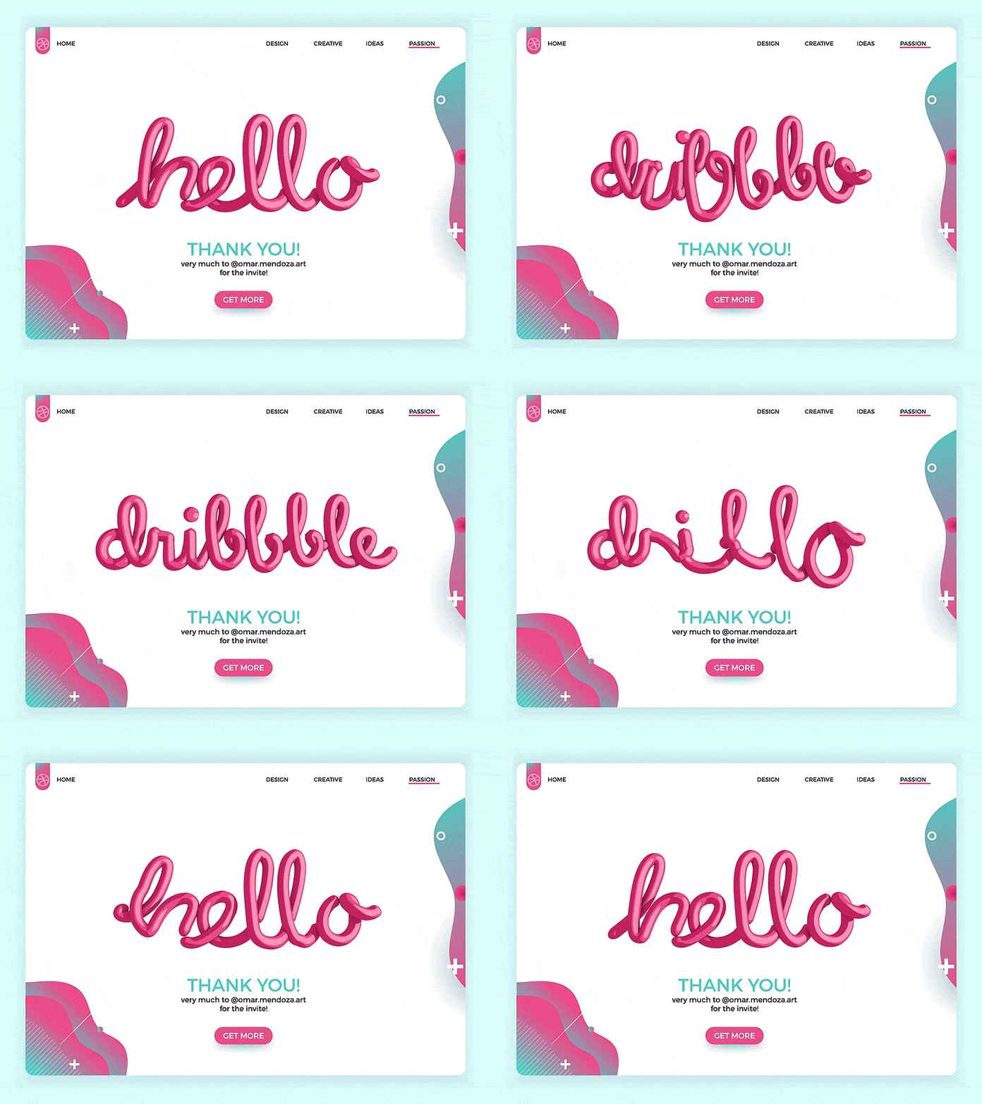
Dribbble is a go-to platform for designers, artists, and creative professionals to showcase their work, share projects, and connect with the design community. So, it makes sense that their pages would be packed with amazing visuals to keep clients engaged.
But here’s the thing: they don’t offer much beyond that. Without any link to connect with the community, the buyer’s journey pretty much ends right there.
Where it slips: Striking visuals cannot make up for no links and no social proof, so the visitor journey dead-ends right here.
Key Takeaways
- Dribbble took a creative approach with their design
- Just added a button without any social proof, which is not a good practice
- Didn’t add any social links, which decreased credibility
Monk Manual
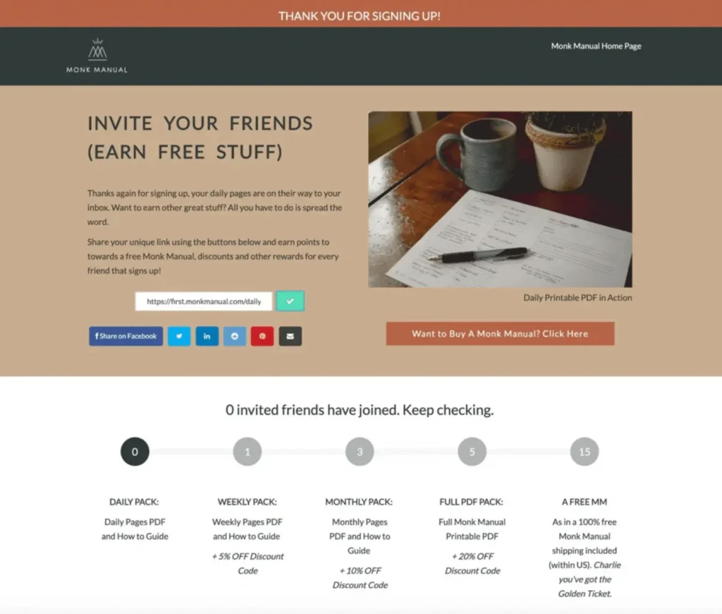
The Monk Manual is a productivity planner designed to help users integrate mindfulness into their daily lives. On their page, this motto is clearly visible through the display of their planner and genuine expressions of gratitude, setting them apart from others.
Their most effective strategy involves offering users free items for inviting a friend, while also providing options to track whether their friends have joined or not. Monk Manual even added a tracker with an additional offer that increases with the number of friends subscribed.
Why it works: A referral invite with a tiered reward and a friend-tracker turns one grateful customer into a channel for more.
Key Takeaways
- Monk Manual provided several options to choose from
- Included an invitation link for easy referrals
- Sweetened the deal with a special offer when users add their friends
The Name Stamp
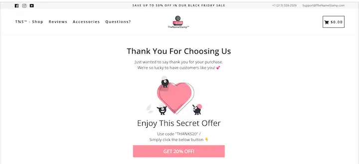
The Name Stamp is a shop that makes customized stamps to imprint a person’s name or signature onto documents or other materials. On their confirmation page, they express gratitude for choosing them.
They didn’t just stop there, they even added a CTA with 20%, and sweetened the deal with cute suspense saying ‘secret offer’.
Why it works: A playful “secret offer” and a discount code drive the next purchase, even if the page skips social proof.
Key Takeaways
- The Name Stamp created a cute suspense to keep their audience anticipating
- Kept their page’s visual soft that compliments their products
- Did not add social media links or any social proof, which is not suggested at all
- Added a desirable discount offer with a code, but only for the customer’s next purchase
Pink Salt Riot
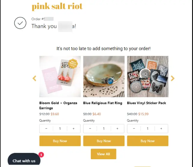
Pink Salt Riot is a faith-based jewelry brand for Christian women that takes personalization to the next level. On their confirmation page, they address each customer by name, making them feel truly special. They also offer enticing options to add more items to the order or continue shopping, keeping customers engaged and appreciated.
This personalized touch not only welcomes clients but also encourages them to explore more of what Pink Salt Riot has to offer.
Key Takeaways
- Pink Salt Riot overloaded their Thank You page with too many elements, which is not a good practice
- Added a few more personalized items for their clients to choose from
- Added an option to view all the products
The Lesson: Addressing customers by their name lifts the page, but cramming in too many elements dilutes the focus.
MailBakery
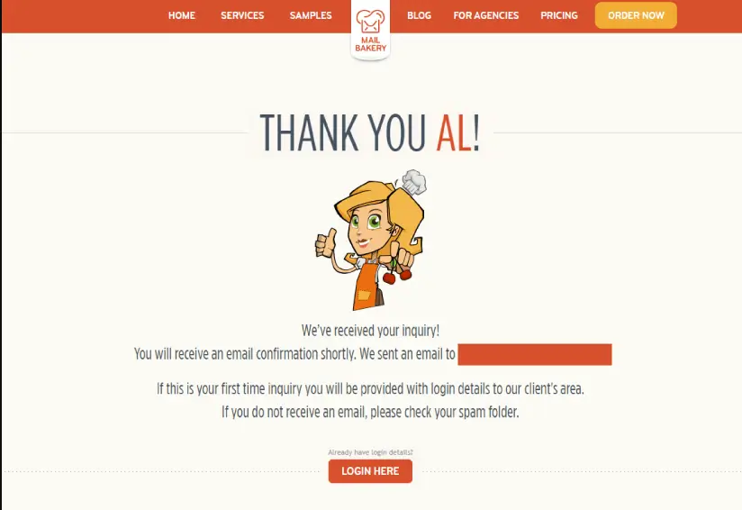
MailBakery is a service that designs and codes email templates for marketing campaigns. On their confirmation page, they instructed their clients to take the next step right away and they mastered the art of personalization like a pro.
Key Takeaways
- MailBakery kept the page concise with few elements
- Kept the copy short, though a clearer next step would help.
- Added a login button but with no social links, it is less credible
The Lesson: Concise and personalized lands well, but a lone login button with no social proof leaves credibility on the table.
World Bicycle Relief
World Bicycle Relief fights poverty by giving people in developing communities durable bikes, empowering them to access education, healthcare, and economic opportunities.
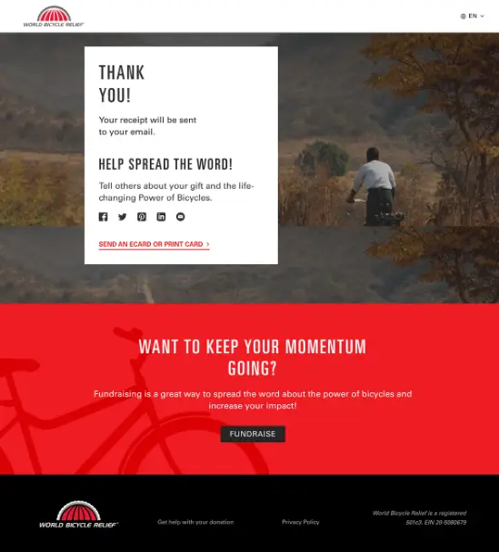
While not a volunteer organization, World Bicycle Relief relies heavily on donations. They express their sincere gratitude with a user-friendly confirmation page that complements their mission. This minimal page features a design theme that reflects the organization’s work.
Why it works: A mission-aligned page that thanks donors, confirms the receipt is coming, and makes sharing the cause effortless.
Key Takeaways
- World Bike Relief thanks visitors for donations and mentions a receipt will be sent via email
- Encourages to share about the gift and the positive impact of bicycles
- Allow sending an e-card or print a card to share the news
- Promotes fundraising and has a clear button to see organization policies
Traits of a Good Confirmation Page
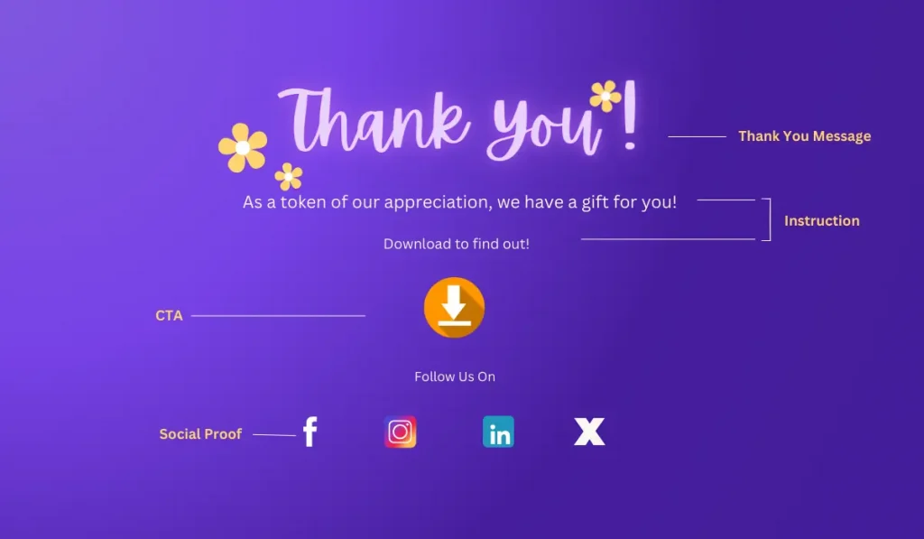
Creating an effective confirmation page is the key to turning your audience into loyal clients. Now that you have seen so many real-life examples with in-depth analysis, you probably have a clear idea about the elements.
But just in case, here are a few essential elements for a well-crafted thank-you page:
- Clear Confirmation Message: Start with a clear, heartfelt message. Appreciate your customers and acknowledge their actions.
- CTA/Next Steps: Don’t end the buyer’s journey here. Include a call-to-action or guide them on the next steps to keep engaging with your brand.
- Contact Information: Provide your contact details and social media handles. Invite customers to join your community.
- Additional Offers: Engage customers with special offers. Keep their interest and encourage further interaction.
- Social Proof/Engagement: Social proof builds trust. Include links to your client community or social media to increase engagement and show your value.
Implementing these elements will help you create a thank you page that shows heartfelt gratitude and keeps customers engaged with your brand.
But, remembering all this information can be tough! The solution?
Here’s a glimpse at a few of the dos and don’ts while creating the page:
| Dos | Don’ts |
|---|---|
| Confirm the action | Don’t discuss financial details unless they are fully committed customers |
| Express direct gratitude | Don’t swamp the page with too many elements |
| Place your call to action or text above the fold | Never neglect mobile optimization |
| Add social proof or referral | Never leave them hanging |
Following these tips, you can make a great page in a jiffy!
Craft a Thank You Page That Converts!
Creating a compelling confirmation page isn’t just about politeness, it’s a strategic move.
By confirming actions, expressing genuine gratitude, and offering additional value, you can turn one-time customers into loyal customers. Remember to keep it clear, concise, and optimized for mobile to ensure every interaction leaves a lasting impression. Implement these tips today and watch your business thrive!
Now, we thank you for being with us, Best of luck in creating a good thank you page!
Samira Farzana
Once set out on literary voyages, I now explore the complexities of content creation. What remains constant? A fascination with unraveling the “why” and “how,” and a knack for finding joy in quiet exploration, with a book as my guide- But when it’s not a book, it’s films and anime.
Table of Content
Related Articles and Topics
-
20 Monthly Newsletter Ideas for When You’re Out of Ideas [+ Real-life Examples]
Even the best ideas fail if your newsletter never lands. Many marketers freeze at a…
-
Real-Life Browse Abandonment Emails from Top Brands [and Why They Convert]
Most stores obsess over cart abandonment, but the real revenue leaks happen before a product…



Leave a Reply