5+ Subscription Confirmation Email Examples to Inspire Interaction
Since the introduction of GDPR, sending a subscription confirmation email has become the new normal in the email marketing industry. However, most people send a generic confirmation email that just doesn’t look good. So how can you make yours stand out?
Sure enough, there are tons of tips, tricks, and strategies available for developing engaging subscription confirmation emails. But guess what will help you even more? —learning from examples!
In this blog, you’ll learn about some of the most effective subscription confirmation email examples and why they worked. We’ll also go over the best practices for writing such emails.
Before we get into the examples, let’s enlighten you a bit about what subscription confirmation emails are and what are the benefits of sending one!
What is a subscription confirmation email?
A subscription confirmation email is the very first email a person gets after signing up for your service or newsletter. This email is sent to the new subscribers to not only take their consent but it is also used for directing or letting them know about the next steps.
A subscription confirmation email can be a message of congratulations, directions on how to access their account, or specifics regarding the content that they can anticipate receiving as a result of their subscription. And since it is the first step of direct communication, you need to be as thoughtful and smart as you can.
Such emails are usually the first email of your email sequence and that’s why you need to be careful with that. Based on the subscription confirmation email you send, you can either convert the lead to your customer or lose them for good.
Benefits of sending subscription confirmation emails
The benefits of sending subscription confirmation emails are way beyond what you can imagine. These emails are not just for formality, rather they can help you in the following sectors:
- Building a positive first impression: When you let your new subscriber know that their subscription was successful through an email, they feel valued. By customizing and personalizing the subscription confirmation email, you can build a great first impression.
- Establishing trust and credibility: Sending a subscription confirmation email not only earns a great impression, but it also earns you credibility. And this credibility makes it easier for you to convert them into customers easily.
- Reducing fake or incorrect email addresses: Subscription confirmation emails can help you filter out fake or incorrect email addresses by requiring subscribers to confirm their subscriptions. This ensures that your email list is made up of genuine subscribers who are interested in what you have to offer.
- Encouraging subscribers to take specific actions: Along with confirming the subscription status of your subscribers, you can let them know about the next steps through your confirmation email. This will help you guide them toward taking specific actions in order to generate more revenue for your business.
- Providing necessary business information: You can add various necessary information like how to log into their accounts, what they can anticipate from their subscription, or how to get in touch with customer service, etc. These will promote clear expectations and a quick onboarding procedure.
5+ ideal subscription confirmation email examples
While almost every other company sends subscription confirmation emails, only a few can make theirs unique and effective. How do they do that?
Let’s find out!
Headspace – utilizing visuals for a great first impression
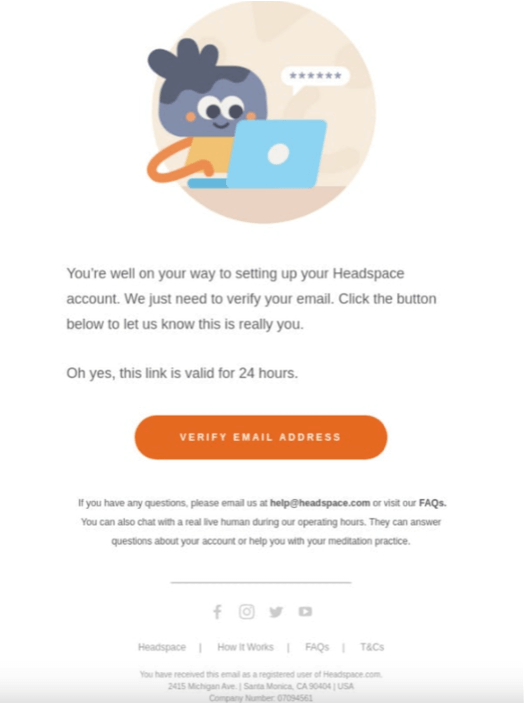
We all know how important visuals are for any purpose, including email marketing. And it’s more important if it’s your first email. Keeping that in the head, Headspace did just the right thing.
They did not go all in with the visuals but did just enough to make it look visually appealing while keeping the CTA button as the main focus. No one wants to read a long email as the subscription confirmation email, and that’s where Headspace excelled. They kept it concise and combined it with a great design.
Mailchimp – getting it done with simplicity
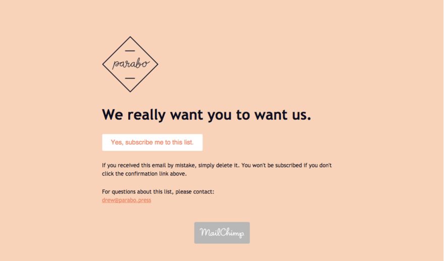
You probably heard that simplicity is the key to succeeding in email marketing. And MailChimp left no stone unturned in order to make their email look as simple as possible. Yet, it’s visually appealing and simple enough to get the job done.
Republic – helping subscribers with easy navigation
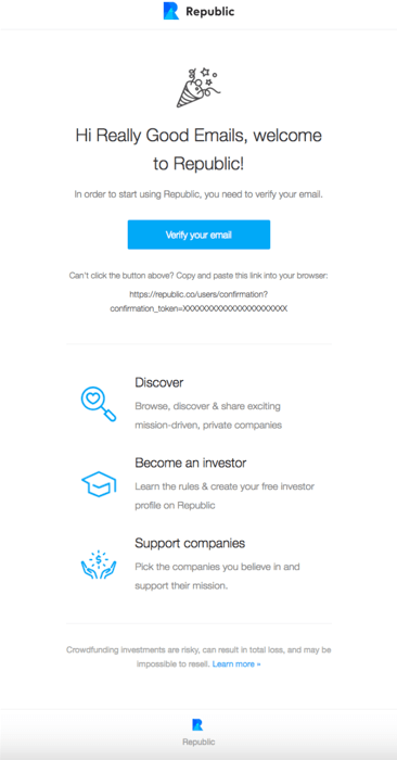
A subscription confirmation email doesn’t necessarily need to be a simple confirmation email. Keeping that in mind, Republic went ahead and helped their users navigate the next steps through their confirmation emails. This way, you can expect fast interaction from your users without putting in any extra effort.
Christmas tree shops – winning users with attractive designs
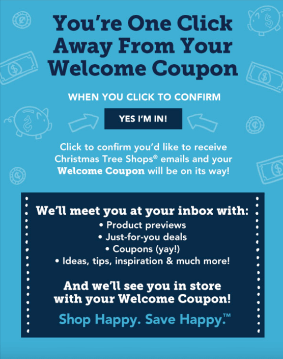
How many times were you so stuck by a design that you gave the design alone a few minutes to admire?
Well, Christmas tree shops came up with such a design for their subscription confirmation email. On top of that, they offered a coupon to confirm the subscriptions.
Offering something works like a charm to get engagement for your business through subscription confirmation emails. And that should be your takeaway from this example.
Hubspot – Keeping it friendly and simple
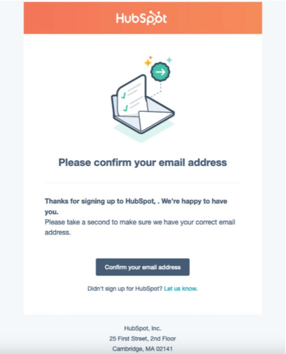
If your customers are just your customers, you are never going to have a loyal fanbase. And in order to achieve that, the first thing you need to ensure is a strong friendship. That’s why Hubspot did not forget to capitalize on a friendly tone to set the bonding straight from the very first email.
Pitch – pitching in with their friendliness
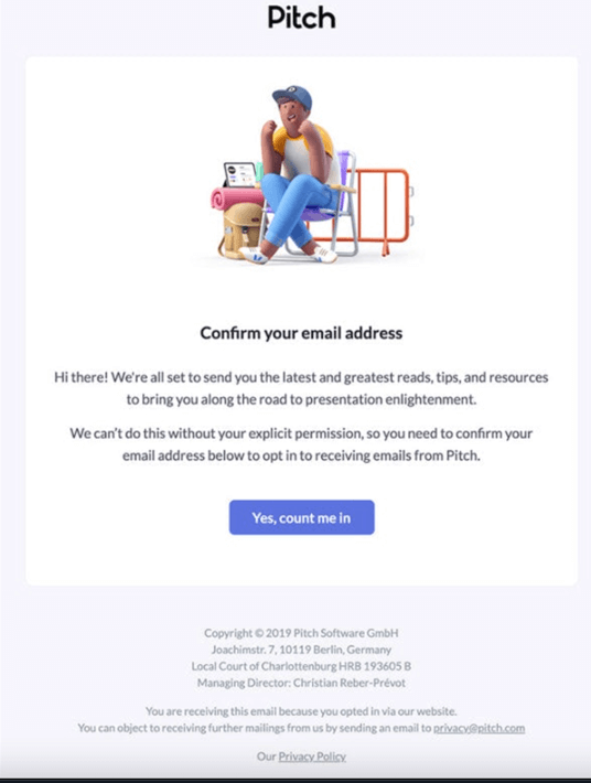
Just like Hubspot, Pitch did not forget to maintain a friendly tone in their confirmation email. They even went ahead and added a custom infographic image. Altogether, they aimed to not only make their subscribers confirm their subscriptions, but rather, they wanted their subscribers to feel valued from the very start.
5 best practices for writing subscription confirmation emails
Now that you have gone over some of the best examples of subscription confirmation emails, it’s time to create yours. Easier said than done, and that’s why we are not leaving you halfway. We went ahead and compiled a list of the best practices for writing subscription confirmation emails.
Clear and concise subject lines
The subject lines are the first thing your recipients are going to notice regardless of the time, date, occasion, or campaign. And it’s the same for subscription confirmation emails as well. That’s why you need to focus on writing a clear and concise subject line even before writing the whole email.
If the subject line of your confirmation email is to the point, the subscriber will immediately open it and confirm their subscription. As a result, your overall email open rate will increase as well. Some of the most practiced subject lines for subscription confirmation emails are:
- Welcome to [Company Name]
- Thank you for joining our community
- Great news! Your subscription has been confirmed
- Ready, set, go! Your subscription is now active
- You’re in the loop – Subscription confirmation
- Subscription confirmed: Get ready for exclusive content
Maintain a friendly tone
While crafting a confirmation email for your new subscriber, it’s important to make the subscriber feel welcomed and valued. The words you put in your confirmation emails should reflect a friendly and approachable tone that acknowledges the subscriber’s decision to sign up for your service or product.
Sending confirmation emails is an opportunity to kickstart the bonding with your subscribers. And this bonding will sail the boat of your friendship toward the direction of more sales and engagement. And if the tone in your email is welcoming, you get all that and more.
Include feature information
Adding necessary information about what a subscriber should do after subscribing is an excellent idea to onboard them in the buyer’s journey quickly. You can even try streamlining a few key features of your product or service to make your users interested right off the bat.
Necessary information may include what content the subscribers may get, how often they will receive it, what they can do to make the most out of your product or service, etc. Providing such information upfront will make it easy for new subscribers to navigate their way through what you have to offer.
Utilize visuals and proper email formatting
Let’s be honest, we all give a visually appealing and well-crafted email a few more seconds just to admire the effort put into building it. And if your subscriber sees that effort from the very first email they receive, they’ll be nothing but excited to receive your upcoming emails.
Just remember to make designs that will portray your brand identity and seem familiar to the audience. Appealing and bespoke designed email that’s well formatted as well will do the job of a long email without irritating your users.
Include a clear and appealing CTA
The confirmation email for a subscription should have a clear call to action. If not, why are you sending emails anyways?
A call to action should encourage the subscriber to do something like follow your business on social media, pay for a premium subscription, or recommend the service to their friends. Including a call to action in your email will get your subscribers invested in your business and keep them coming back for more.
Make sure the subscriber can easily understand the next step by providing a clear and easy-to-understand call to action. Doing so has the dual benefit of increasing interaction and building a fan base that will stick with your brand through thick and thin.
Wrapping up
Given how immensely important it is to send subscription confirmation emails, it’s reasonable that you want to learn and take inspiration before writing yours. We hope you found the examples in this blog inspiring and utilized the best practices.
Don’t forget to let us know about any difficulties that you may face while developing your subscription confirmation emails. You are just only one comment away from getting in touch with us.
Sakhawat Showrabh
From writing poems and short stories to writing technical stuff about WordPress and email marketing, plenty of things have changed. What didn’t change is my love for writing and wasting time. When I am not writing, I waste my time peacefully.


Leave a Reply