12 Email Design Trends to Follow and Excel in 2024
Another new year has arrived and it means new opportunities are ahead. Some design trends will become ineffective, some will survive, and some new trends will take the limelight. As email design trends are evolving this year, you need to keep up the pace to survive in the modern world where the attention span of the human race is decreasing!
However, what should you do to win the congested digital inbox of your recipient?
Well, following the most effective tactics and practices for creating appealing and compelling email designs that capture the reader’s attention can be your only ultimate weapon. In this article, we’ll learn about the latest email design trends that’ll help you to design visually appealing, engaging, and converting copies.
Let’s dive into the exciting world of email design trends.
Why is email design important?
The world is changing rapidly and people’s interests are also evolving. The old-fashioned text-based emails are losing attraction because we’re living in a world of immersive visual experiences.
An average person receives 100-120 emails daily. So, it’s important to design a captivating email that’ll help you to build a strong connection with them. If you fail to design a compelling and engaging copy, your email will probably join the ignored list. The recipients could go even further —marking your email as spam!
Nowadays people love to read emails that are enjoyable and visually appealing. And that’s where most businesses fail to meet the expectation. They invest heavily in their website and landing pages to ensure the best user experience but ignore their marketing emails.
Unfortunately, most marketers forget that email personalization blended with the latest design trends will help them to tailor timely, compelling, and relevant messages. Especially for B2B businesses, great email content can strike the iron but great email design makes it hot to shape.
How?
Great design helps the reader to navigate through the content and acts as an irresistible force to catch the reader’s attention and inspire them to continue reading if they open the email.
A great email design will help you to compel the reader, engage them with your marketing messages, and finally inspire them to take the desired action. It has many positive outcomes such as:
- Higher engagement rate
- Improved readability
- Higher conversion rate
- Strong relationship buildup
- Clear communication
- Brand recognition
Key elements of effective email design
Every email you send to the recipient is an opportunity to build a relationship, convert leads into prospects, and eventually turn them into paying customers. It helps to build brand awareness, generate sales, and earn money for your business.
However, if we fail to convince the recipients to open our email and guide them to the necessary action, you’ll most likely fall short of your goals! And that’s why, we should give each of these key components of an email the highest attention possible.
Let’s take a look at each of the major components of a good email.
- Header
The header section might not seem like a design element but it’s the first thing your recipient is going to notice in their inbox.
It contains important technical and routing information such as the sender’s email address, recipient’s email address, date, subject line, etc.
The subject line is the first thing your recipient is going to notice. So, make sure you craft a killer subject line that’s going to entice the reader and drive them to the email body. Follow these tips to craft a magnetic subject line-
- Keep it concise in length, generally six to ten words
- Infuse personalization to improve open rate
- Use power words to generate urgency
- Ask questions to drive the recipient to the email body
Dive into some amazing sales prospecting email subject lines
- Preheader
The preheader is a short snippet next to the subject line, enticing the recipients from mobile devices to act. It delivers a brief preview of the entire email you send to your recipient without opening it.
..
So, it’s important to choose wisely what you’re going to write in the preheader. A powerful preheader acts as a rigid force to grab attention and convince the reader to continue with the email.
Make sure your preheader is optimized for mobile devices and concise in length between 30 to 80 characters and delivers what your email body promises.
- Logo & colors
Brand logo and color play a significant role in establishing and maintaining brand identity, trust, emotional connection, and consistency.
When the recipients open your email they’ll notice your brand logo and color in the first place. Attractive design and vivid color can make a great impression on your brand.
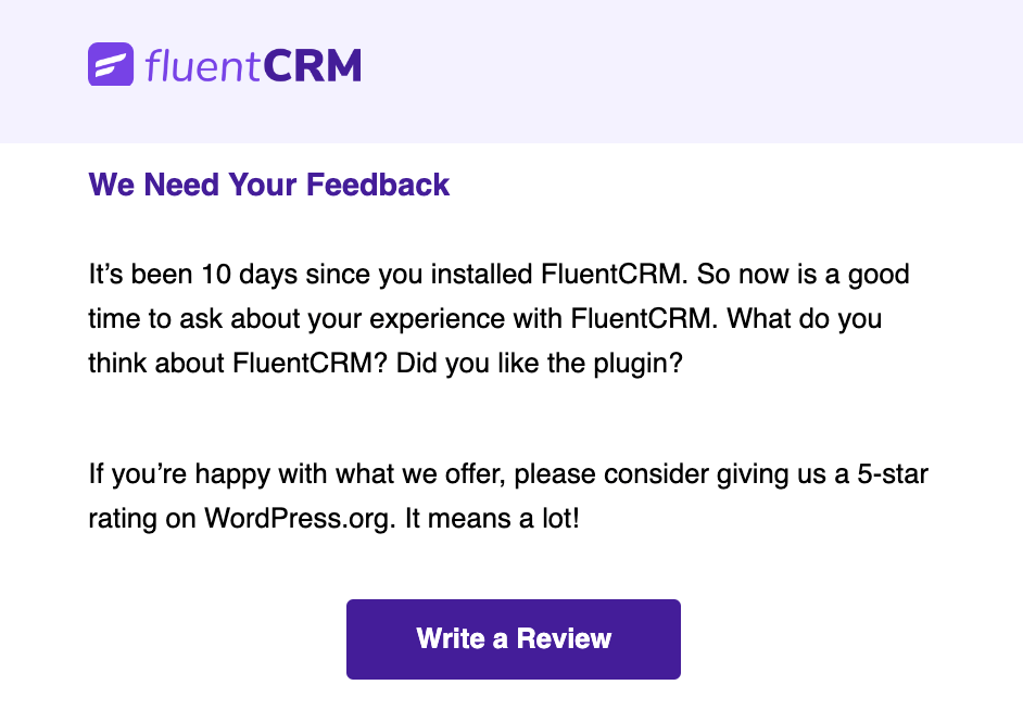
Since logo and colors are your brand ambassador you should use these design elements consistently in your emails so that your contacts can memorize your brand and recognize it effortlessly.
Following this practice will help you to sow the seed of your brand and eventually over time your recipients will recognize your emails in their inbox and will more likely engage with them.
- Image
As the current era is ruled by visual representation a text-based email will most likely need more appeal and engagement. Images play a significant role in email marketing and have the potential to draw attention and engage the reader with your message.
Powerful image design can create a visually compelling and engaging email that effectively communicates your message and improves engagement.
So, while designing images for email you should keep in mind that it should support the purpose of your email and make an immediate impact when someone opens your email.
- Text
Your text is the carrier that conveys your message to the reader. When a recipient opens an email he/she will scan the whole email before reading it. If your email text doesn’t appear stylish and eye catchy then it’ll lose attraction and readability.
You should use a 22pt font size for headings and a complementary color that best matches your brand color. The font size of the email body text should be at least 14pt to ensure comfortable viewing.
These practices will ensure your messages are clearly communicated and your audience find it enjoyable to read.
- Call-to-action
Why are you sending a marketing email to your recipient?
It’s because you want to deliver them value and inspire them to take your desired action. And when it comes to enforcing the expected action, CTA does the job perfectly.
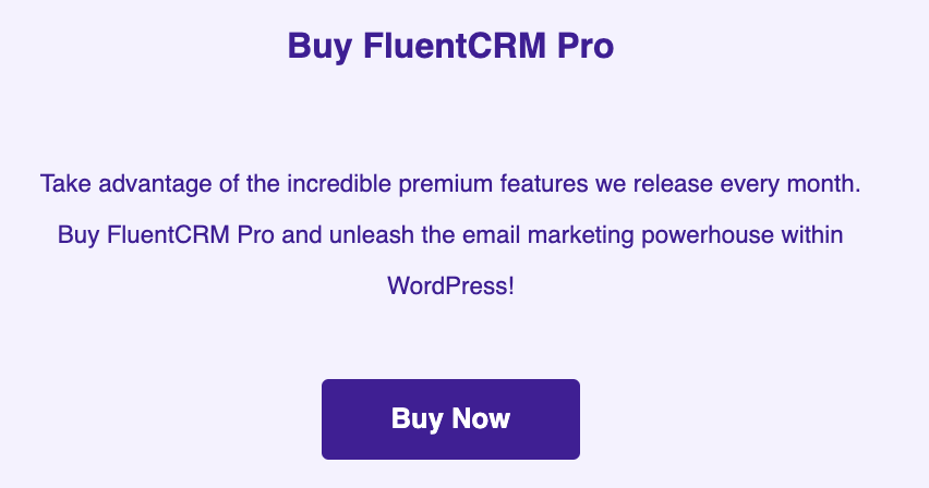
A powerful and visually distinct CTA packaged with other elements will help you to accomplish the ultimate purpose of your mailing.
Therefore, design your CTA in such a way that it’s visually attractive, perfectly shaped, and easy to interact with.
- Footer
The email footer is the final segment of your message. It’s located at the very end of your email and contains company information such as company address, location, social links, and an unsubscribe link to endure the CAN-SPAM Act.

You should maintain a clear and concise hierarchy to design a compelling footer section since it’s the closing element of your email communication.
How?
Follow these tips to design a footer section that’s simple, transparent, and easy to interact with-
- Use simple and minimal design to avoid excessive information
- Create a hierarchy based on the action your recipients want to take
- Organize the footer section with headers and labels to improve readability
- Use HTML background color to distinguish the footer from the main body
- Include a sign-off message in a funny way to bid adieu
12 exciting email design trends to follow and stay ahead of the game
2024 is all about displaying your message in an aesthetic way. It’s about replacing your boring emails with design that colloquy. This year is all about embellishing your email with an aesthetic design that is going to entertain the reader.
As new design trends are evolving this year, you need to know and harness them in your email to respond to the current expectations and prove why your email is unique.
Let’s explore some demanding email design trends of 2024 that are going to take the appearance of your emails to a new height and place you ahead of your competitors.
Minimalist design
Do you think that crafting a complex layout will impress the reader?
Well, the answer is no! Since the attention span of the human race is decreasing gradually, complex email presentation means taking suicidal attempt.
A simple, sleek, and clean design can do the trick if you can deliver the value proposition in a clear and concise way. It’ll help you to draw a positive impression and the recipient will love to hear from you again.
Here’s a great example of a minimalist approach:
Follow the following tweaks to create a minimalistic email—
- Avoid unnecessary details and focus on concise formatting
- Use decorative fonts on headings and important words only
- Display creative product images to steal the attention
- Use white space and monochromic color schemes to design consumable emails
- Introduce animation, bold typography, and abstract illustration
Interactive engagement
Who would love to read an email that isn’t engaging?
The next design trend that requires your attention is interactive and engaging content. The introduction of interactive and dynamic content will generate a surge of engagement yielding a high click rate and click-through rate.
The application of interactive elements will catch the audience’s attention, ignite interest, and convert them just like the following email-
The exciting news is HTML5 and other web technologies have opened the door to inserting interactive elements such as sliders, surveys, polls, videos, etc. helping email marketers to create interactive emails.
Follow these effective tips to make your email interactive:
- Drop relevant videos
- Place dynamic CSS-animated buttons
- Insert image rollover
- Present products using widgets
- Insert gamification elements
- Include forms and testimonials
Floating product display
When you’re ready to launch a new product or a new version the most important thing is informing your target audience about the arrival to build a spark of anticipation.
You need to design a captivating product launch email that’ll immediately capture the attention of the reader and encourage them to buy your product. It’s a massive opportunity to generate demand and sales.
Now what’s the most important content of a product launch email?
Obviously the product image and this year designers are following the trend of exhibiting floating products to catch the attention.
A floating product will help you to capture the recipient’s attention immediately, encapsulating what is your product all about. The 3D representation of the product will set a realistic atmosphere, displaying your product as if they’re live just like the below example-
If you follow this design trend then it’ll help you to strike a tremendous positive impact on your target audience which in return will generate massive sales.
Geometric shapes and linear elements
Just like the past few years geometric shapes and linear elements will play a crucial role in illustration.
This year geometric shapes will wave our inboxes and catch attention to the focal point. It’s because geometric shapes add a fancy touch and possesses powerful artistic features that are easy to manipulate the reader.
Geometric shapes and linear elements together with the power of illustration will help you to generate stunning designs which will deliver an aesthetic vibe to the reader.
Let’s take a look at this aesthetic email designed using geometric shapes:
Now these are the most trending geometric shapes of this year:
- Square
- Rectangle
- Triangle
- Circle
- Polygon
- Rounded corners
To subtly deliver the context of your message using geometric shapes and lines we have the following suggestions:
- Make intricate geometric shapes the focal point of your message
- Embrace the elegance of simple lines as decorative backgrounds
- Infuse brand personality and charisma by incorporating hand-drawn shapes
- Use abstract and unconventional shapes to inject excitement
- Combine geometric shapes, lines, and images to create a harmonious blend
- Guide readers from top to bottom using lines
Visual content
Studies show that people lose their attention after 8 seconds and prefer scanning to reading. So, sustaining your audience’s attention and keeping them involved with your email till the end is challenging.
But the integration of visual content will assist you in designing a more engaging email. One interesting fact about the human brain is that it processes visual content 60000 times faster than text. Nobody is going to avoid visual content like this in their inbox-
That means adding images, graphics, and illustrations will help you to ignite the spark of anticipation, capture attention, and eventually deliver your message conveniently. Instead of using congested text try to make short phrases and present them visually that offer value.
Animated presentation
The next design trend to draw attention is animated product display. The animated exhibition of products and other aspects of email will revolutionize modern-day email marketing.
Motion pictures have a high impact on humans than static images. Currently, email marketers are using animated GIFs to enchant the reader. This practice helps businesses to stand out in the crowded inbox and steals the show just like the following animation-
But using excessive animation can make your email bulky and unsupported by email clients. So, avoid using too much animation in your email to make it optimized.
We recommend using subtle animations in the email, instead of animating the entire image animate a single element of the image.
3D illustration
Using 3D designs in your email campaigns can help you to enhance the visual appeal, improve product presentation, and make your email more engaging as the subsequent email-
A 3D image helps the reader to comprehend the physical appearance of a product without touching it. As a result, brands will continue using photorealistic images to showcase their product.
You need to understand the subject and objective of your email before drawing a 3D object, then reflect this on your 3D presentation, and finally select the best image to send your recipient.
Vibrant colors
This world would’ve been so boring without colors, isn’t it?
The same goes for email which is an important communication tool for your business. This year is all about vibrant colors and you need to know which color palettes will be most effective for designing your business emails.
The practice of bold colors will be effective just like the previous years but we expect to witness the introduction of soft gradient colors, high contrast, and striking accent.
Consider using the following colors in your email design:
- Yellow
- Emerald
- Neon or electric green
- Light purples
- Periwinkle
Moreover, gradient effects will become more popular as time progresses. This transitioning style will add a new dimension to your email design by blending two or more colors.
From backgrounds, and images to CTA gradient effect will reign inboxes this year. The soft blending of different colors will produce an aesthetic design that’ll help you to deliver a calming effect on emails like the below example-
To create visually appealing effects on your email, experiment with the various shades within the same hue. It’ll help you to come up with unique and captivating colors that’ll dominate your recipient’s inbox.
Unique and bold typography
In addition, typography is going to be the next big thing to look out for. Typography will lead email design with a bigger and bolder attitude, leaving a dramatic effect on your email.
The combination of the clean and exclusive font will give your message the freedom to talk, making it more engaging. It’ll help you to deliver the message without adding any strokes of images or you can even use typography with images to take a deeper shot.
What should be your font combination for typography?
Combining Sans-serif font with Serif font will help you to create a visually appealing and captivating design. Consider using Sans-serif fonts like Helvetica, Visby, Futura, Proxima Nova, and Calibri to merge with Serif fonts like Georgia, Times New Roman, Baskerville, Garamond, and Didot.
Now here are the guidelines to follow and effectively use typography in your email design-
- Place your message theme in typography to help the reader absorb the purpose promptly
- Avoid bolding entire text and carefully select your headline text
- Insert it at the top of your message to make a quick impression and improve interaction
- Create a perfect symbiosis of visual and typography
- Play with colors but don’t use them extravagantly
- Ensure your typography is discrete and identifiable from similar bold colors
- Ensure substantial spacing between elements to improve readability
- Always create a responsive design to fit every user, screen, and device
Dark mode
The dark mode is going to continue its legacy from 2022 since it has become a factor to consider while designing your email. This approach helps to boost engagement and conversion just like the following email—
But what’s the reason?
This reverse color scheme has the advantage of displaying pleasing fonts on a dark background which ensures a flawless and comfortable experience that results in the following benefits:
- Significantly reducing eye strain chances on low ambient light and ensuring comfortable viewing
- Improving email legibility and readability experience for users both from desktop and mobile devices
- Saving battery juice and extending battery life for mobile and laptop users
- Great collaboration with other design trends such as animated gifs, bold typography, neon colors, etc.
We hope now you’ve understood the importance of dark mode in email design. Now follow these tips to design your next dark mode email:
- Add white space to your content to improve legibility and reading experience
- Use the light text on a dark background to ensure eye comfort
- Introduce adequate contrast between the text and background
- Avoid using pure black and be mindful of color psychology
Mobile Optimization
Since mobile users outnumber desktop users you need to ensure mobile-first design to ensure mobile optimization. People tend to read their email on smartphones and if you don’t consider mobile users then you’re losing more than half of the population.
A mobile responsive email design will increase engagement, ensure better deliverability, and improve ROI.
Here’s an example of a mobile responsive design where the left email represents a poor user experience and the right email is an optimized version for mobile users:
That means when you’re designing your marketing emails always consider the responsive design and mobile-optimized template. Also to maximize the user experience use touch-friendly elements, optimal buttons, and easily interactive links.
Artificial intelligence
It might surprise you that artificial intelligence has secured its spot in our list but that’s the reality. The power of AI together with human creativity can be fruitful for your business in the coming years.
The early adopter of AI technology such as ChatGPT will have the upper hand in email marketing and email designing. Because this emerging technology is working behind voice search, chatbots, smart assistants, etc., and setting a new dimension to communication.
The application of AI in email marketing campaigns and automation will help you to achieve the following objectives:
- Generating ideas that you couldn’t imagine before
- Writing email text promptly with just a few commands
- Generating images within seconds
But if you’re planning to write your whole email copy with AI then it’s a red signal. Don’t use AI to write emails that don’t have any human emotion. It’ll fail miserably and your subscribers might not want to hear from you again. Don’t forget humans are invincible to AI!
Design futuristic emails!
2024 is all about embracing new design trends, shaping your ideas, and turning your imagination into reality. With the advancement of AI, minimalist approach, animation, illustration, interactive content creation, and mobile optimization we can say the future of email design is more dynamic and better than ever.
So, don’t miss the train of the latest evolving design trends of email marketing to build up a strong brand reputation, amplify your authority, improve your brand identity, and stay ahead of the game.
We hope that the aforementioned email design trends will help you to design captivating emails that hit the recipient’s inbox, deliver them entertainment, and generate high ROI.
Tuhin
Digital Marketing Strategist
Hi! Nice to meet you. I’m a guy who loves to explore, learn, and share knowledge. I spend most of my time catching up with marketing tips & tricks. When I’m not busy with any of these, you’ll find me with a book, exploring the city, or playing my favorite games.


Leave a Reply