
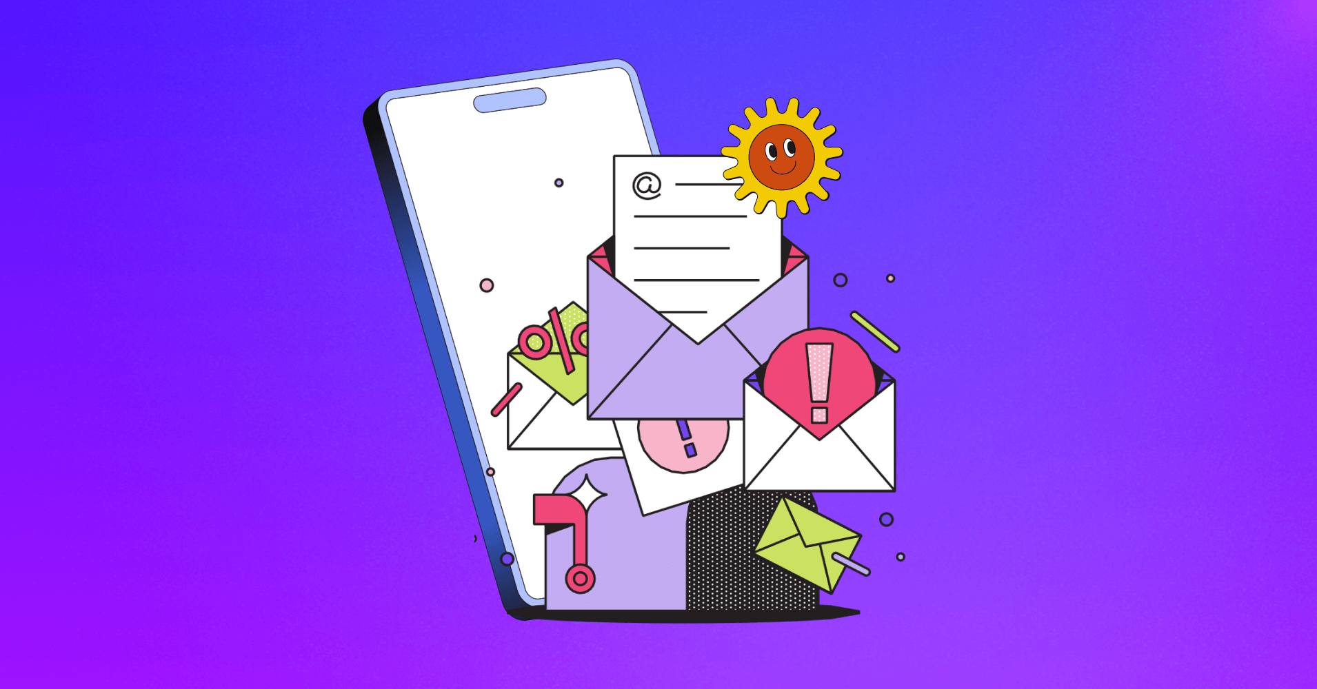
13 Do’s and Don’ts of Creating Responsive Mobile-optimized Emails (+ Bonus Tips)

Summarize with


Before the nitty gritty, let us take you back in time.

You’re a digital marketer of early 2000! Back then — desktops ruled, and mobile-optimized emails seemed like a distant concern.
Fast forward to 2024 – the game has changed. Smartphones have largely taken over the digital landscape, and like everyone else you surely heard of the term – mobile optimized design.
Therefore, your emails need to be optimized for small devices. Why?
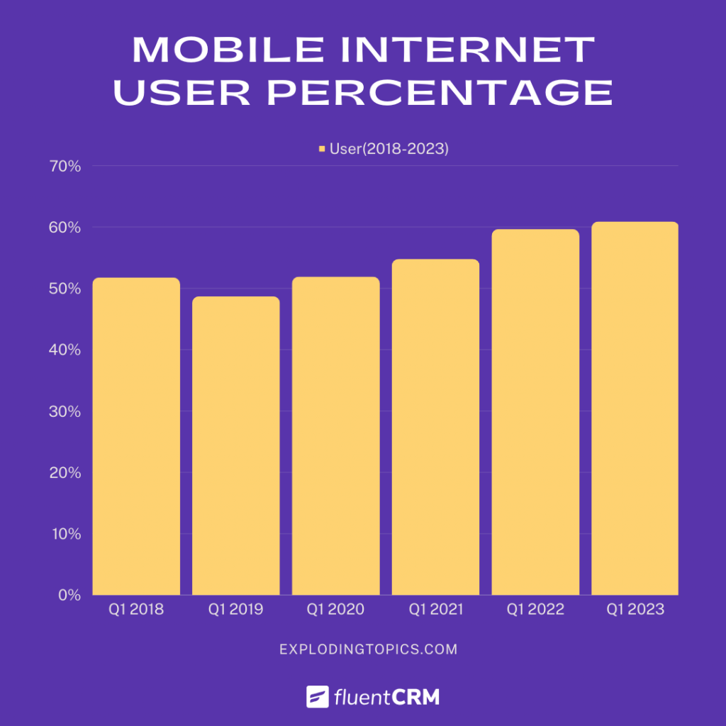
As a matter of fact, 43% of emails are now opened on a mobile device, in contrast to 19.4% and 36.1% on desktops and webmail clients!
Therefore, responsive email design should be your first concern.
How do you do that?
Well, we’ll break down the concept of mobile-friendly email. Also, share with you what to consider and avoid while creating your next email campaign.
What are Mobile-friendly Emails?
A mobile-friendly email is simply an email that’s perfectly adjusted for mobile devices, ensuring the text and design look great on any screen size.
So, the next time you sit down to design your emails, approach it with a “mobile-first mindset“, along with these key factors in mind:
- How many people open your emails
- The clicks you get
- The return on your investment
Designing emails is about keeping all these valuable metrics safe. And, ensuring your emails look fantastic, no matter where they’re viewed!
Why is Sending Mobile-optimized Emails So Important?
Now that you know, what mobile-optimized emails are and the rewards they bring.
But, we don’t want you to just take our word for it.
Let’s show you a few more email design trends that might give you a clear picture of how to design emails for your mobile viewers:
- Mobile-friendly email campaigns see a 15% increase in unique mobile clicks!
- As of 2023, over 55% of website traffic comes from mobile devices!
- 45% of consumers unsubscribe from promotional emails if they don’t work well on a smartphone!
- Mobile-friendly emails are a core marketing strategy for 56% of email marketers!
- Top brands gained 40% higher click-to-open rates when they sent exclusively responsive emails!
13 Pro Tips for You to Create Mobile-friendly Emails
Okay, now it’s clear that designing mobile-friendly emails is highly important.
But, how can you cater your email marketing strategy for devices with screens 7 inches or less?
Here we have assembled some key tips that industry experts consider and avoid while preparing mobile-friendly emails.
So, broaden your knowledge and put it into practice to see how your email marketing metrics change.
7 Do’s of Mobile-friendly Email
Savvy marketers thoughtfully pre-plan before launching their email campaigns. Throughout the process, they consider many factors before designing an email.
These considerations aren’t just about making mobile responsive emails; rather they ensure the email looks stunning on desktops, laptops, tablets, and every device in between.
So, let’s unveil these game-changing factors:
Short Yet Crafty Subject Lines & Pre-header
Like all other elements – subject lines also get shrunk on small devices. That means you have even fewer resources to convince your clients to open your emails.
So, what you can do is – apply the “the shorter the better” rule.
Usually, 60 characters are the limit for crafting email subject lines but, mobile devices squeeze that limit to 30-35 characters. So, your audience will only view the first portion of the subject lines.
Now, you don’t have to shrink the subject to 30 characters; rather, you should aim to entice your audience with that first portion, so they feel the urge to read further.
Remember, the first portion holds the most value!
Quick Tips:
- Keep your email subject lines within 35 or fewer characters.
- Keep your pre-header between 50-100 characters.

Skimmable Content
Survey says: About 9 seconds is all people spend looking at an email!
For mobile users, surely that time frame would be even lower! Because mobile readers would be busy multitasking.
Hence, craft a short and sweet email copy, so people will skim through it in less time and lead to your designated CTA (Call to action) right from the word go.
Quick Tips:
- Keep important info at the top
- Go bite-size with (i.e. bulleted lists, numbering, and short paragraphs)
- Make email copies between 50 and 125 words
Single Column Layout
Mobile devices have limited space – we don’t recommend using a multi-column layout because it requires more space and your audience has to zoom to view elements.
So, it’s best to design a simple single-column layout.
With a single-column layout, your contents and (most importantly) your CTA’s will appear clear to your readers.
And, if you have multiple elements that need to be fitted in an email, then try making emails vertically scrollable.
Quick Tip:
- Single-column layouts with 600-pixel widths are best for mobile
Left is Right
Visual presence should be a vital element in your email marketing strategy. Visually catchy emails draw more attention.
That’s why when you deal with multiple sentences, align contents to the left.
Because, when your content is on the left – it ensures:
- Better visual appearance
- Smooth reading flow
- Natural left-to-right reading pattern

Leave White Spaces
A wall of paragraphs, buttons, and images won’t create a good impression on your readers. Rather, it’ll create discomfort in readers’ eyes.
Solution?
Leave enough white space between – paragraphs, links, buttons, and images.
Spaces, padding, and margins in between interactive elements will give readers:
- Breathing space
- Make content scannable
- To click on the elements they intended to
Quick Tips:
- Keep text shorter than 20 words
- Limit paragraphs to 1-3 sentences
- Add 10-pixel padding around interactive elements
Small Email Size
You added images, texts, gifs, embedded content, etc to craft an interactive email. Now, ask yourself – will it load quickly on mobile?
In most cases, it won’t! Rather, it will cut off potential email clients.
So, we recommend you reduce the overall email size, because tiny emails mean:
- Faster load time
- More Accessibility
- Better deliverability
Quick Tips:
- Emphasise more on text instead of large images
- Keep the HTML weight of your email around 75 KB
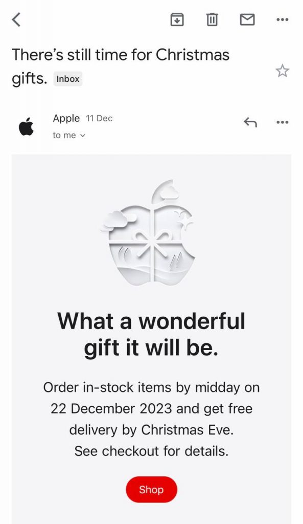
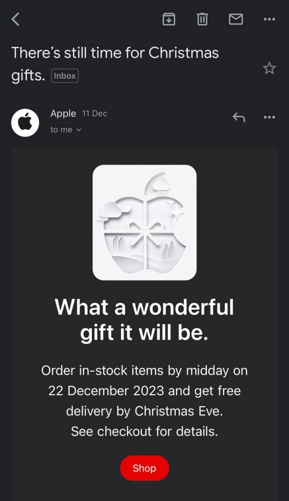
Dark Mode Friendliness
With the rising popularity of the dark mode feature, there’s a high chance your audience set their mobile theme to dark mode.
Stats say: On average 35% of Apple email clients used Dark Mode!
That’s why, you should ensure – your emails are adjustable with both light and dark modes so readers have the best experience.
5 Don’ts of Mobile-friendly Email
Some things raise concern and they should not go unnoticed! That’s why, before hitting the send button experts make sure these things are optimized.
Here are a few things pro marketers avoid before sending their valuable emails:
Unoptimized Images
Slow load time is a curse when you are sending promotional emails as it affects your email marketing KPIs.
And, mobile devices load images slower than other large devices!
Hence, you need to shrink the image size before sending emails to an audience.
Large images are data drainers – slowing download times and potentially demoralizing readers. Moreover, some devices might not load those images.
Our advice? Trim image sizes, and remember to optimize ALT text. It ensures – your audience still gets the gist even if the images don’t load.
Quick Tips:
- Strike a 50/50 or 60/40 balance between text and images
- Use an online compressor such as TinyPNG to shrink large images
Menu Bar Clutter
The menu bar or what we typically refer to as “Navigation Bar” is an essential element for websites – allowing users to browse through effortlessly.
But, for emails – it’s NOT NECESSARY!
Because, in mobile devices, it’s a complex task to size them appropriately and even if you manage to do that, it’ll be frustrating to click on menu options precisely.
Link Stacking
When we say “link stacking”, this is what we mean:
FluentBooking
FluentSMTP
Flunent Forms
So, when you stack up multiple links in emails, it’s highly likely readers will accidentally click on the wrong links.
Besides there’s a big chance of mistakenly adding the same link to multiple destinations.
Quick Tip:
- Add links, but avoid stacking, and make sure to check links while testing.
Tiny Fonts
By default, phones squeeze each element. It turns into a major concern when you use small font sizes – as readers either have to zoom in or start squinting their eyes to read details.
That’s why, large fonts are:
- Readable
- Skimmable
- Touch-friendly
And, when your goal is conversion through your emails, then these factors make your email accessible to all users.
Quick Tips:
- Consider text sizes of 14px and 20px as a minimum for the body and header
- Use dark text color on a light background
Small Clickable Elements (e.g. CTA)
Mobile email readers are always on the go.
If generating leads, traffic, or revenue is your goal, you must – make the best use of clickable elements such as CTA’s(Call-to-action), social media icons, etc.
While creating promotional emails, craft button-like CTAs, which are:
- Eye-catchy
- Touch-friendly
- Actionable & Big
Also, often readers don’t go through the whole email, so we suggest- keeping calls to action at the top.
That way, you are stating your point quickly, and avoiding your potential lead from slipping away.
Quick Tips:
- Make CTAs at least 44 x 44 pixels
- Avoid image-based CTAs

Bonus: Test, Tweak, Triumph
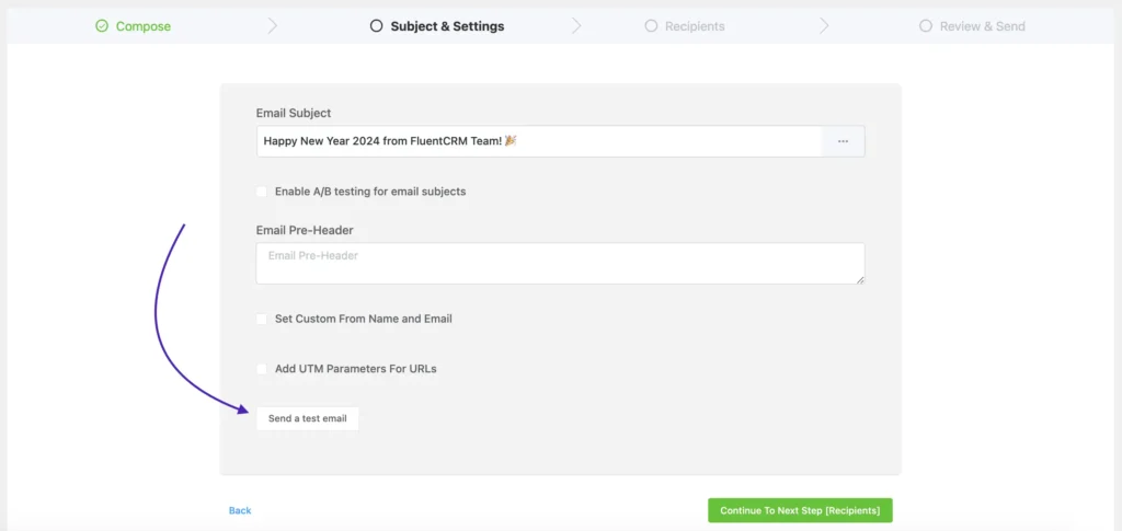
Putting all your efforts into mobile optimizing your emails won’t be a bargain if they aren’t tested on multiple devices!
Very often, your crafted email might look perfect on one device and different on others.
That’s why, you should proofread your emails and test their responsiveness on multiple mobile devices.
But, do you need multiple devices to test your email? No, you won’t.
Multiple email marketing platforms such as FluentCRM, include test mail and preview options to test your designed email across multiple devices.
Mobile-optimized Emails = Better ROI & Leads
With more and more people connecting through mobile phones, the future of email marketing hugely depends on mobile optimization.
Needless to say, email marketing is a medium to:
- Make profit
- Bring in leads
- Generate traffic
- Increase brand awareness
And, whatever your goal is, the best way to achieve it, is to make sure your email marketing campaigns are well-optimized. Not only for mobiles but for other devices.
Our final suggestion- use analytics to find out your audience’s device usage and apply the best practices of mobile-optimized emails if you haven’t applied them yet.
So, which tips did you find helpful? Share your thoughts in the comments!
Tanzil Ebad Efti
Content Writer & Strategist
Words are my favorite playground. As a Creative Writer at WPManageNinja, I don’t just produce content; I tell stories. By mixing fiction and metaphors with real-life examples, I turn my writing into a creative journey that’s easy for readers to digest and relate to.
Table of Content
Related Articles and Topics
-
How to Create a Newsletter Archive on WordPress within 5 Minutes!
You send a newsletter to your subscribers, once they reach their inboxes and read it…
-
New Gutenberg Editor: The Email Builder WordPress Users Always Wanted in FluentCRM
If you’re a WordPress user, isn’t it satisfying to write in Gutenberg? You click the…
Leave a Reply