5 Best Design Tools in 2026 for Designers, Marketers, and Creative Teams

Summarize with


Last Updated:
Every design tool wants to be the one app you never leave, and none of them quite manage it. That is fine, but it becomes a problem when a team standardizes on a single tool and then forces every job through it anyway, which is how you end up rebuilding the same landing page three times because the mockup was never going to become a real website on its own.
And guess what? The tool is rarely the thing that failed. The job was handed to the wrong one.
So the five picks below are organized by the kind of creative work each tool is exceptionally good at. Figma makes collaborative interface design feel natural, Canva helps marketing teams ship polished assets without turning every request into a design ticket, Photoshop still owns serious pixel work, Illustrator gives you vectors that stay sharp from a favicon to a trade show wall, and Framer closes the gap between designing a website and publishing it. You will also get a working email design process at the end, because marketing design eventually has to survive an inbox, and that is where most design stacks quietly fall apart.
Quick Comparison
What Makes a Design Tool Worth Using?
A long feature list is not enough, because a design tool only earns a place in a real workflow when it helps you move from idea to finished asset with less friction than the alternative.
For this list I looked at six things: creative control, speed, collaboration, reusable design systems, the quality of the final output, and what happens after the design gets approved. That last point matters more than it sounds, because a website mockup eventually has to become a website, a campaign graphic has to be resized into five formats, and an email layout has to survive an inbox that may never load the images.
The five tools below solve those jobs in very different ways.
1. Figma: Best Overall for UI/UX and Collaborative Digital Design
Figma is the easiest tool on this list to recommend to a modern digital product team, because it gives designers the freedom of a visual canvas while adding the structure serious interface work needs: components, reusable libraries, variables, responsive layouts, prototypes, shared files, comments, and developer handoff.
Why Figma stands out
The biggest reason is not one flashy feature, it is the way Figma keeps design work connected. A product designer can build a component, another designer can reuse it, a writer can comment on the copy, a product manager can review the prototype, and a developer can inspect the design without waiting for a separate specification document.
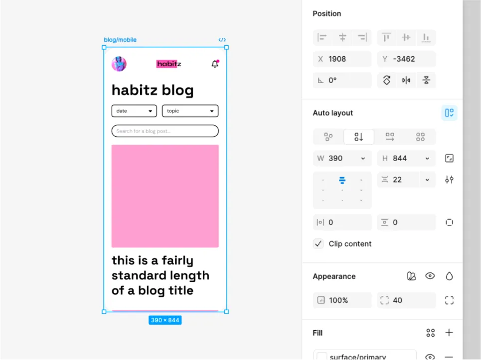
Auto Layout is especially useful for responsive work, because instead of manually repositioning every element when a label changes or a frame gets wider, you define direction, spacing, padding, alignment, and resizing behavior once. Figma supports vertical, horizontal, and grid Auto Layout flows, so components respond as their content changes.
Variables push design systems further, since colors, numbers, strings, and other values can be reused across files and modes, which makes light and dark themes, responsive states, spacing systems, and brand updates far easier to control.
Where Figma fits best
- UI and UX design
- Web and app interfaces
- Wireframes and interactive prototypes
- Design systems and reusable component libraries
- Cross-functional product collaboration
- Digital campaign and landing page concepts
Where it is not the best choice
Figma handles plenty of visual work, but it is not the first tool I would open for detailed photo retouching, complex image compositing, or precision illustration, and Photoshop and Illustrator still make more sense for those jobs. For interface and collaborative digital design, though, Figma remains the strongest all-rounder here.
2. Canva: Best for Marketing and Everyday Design
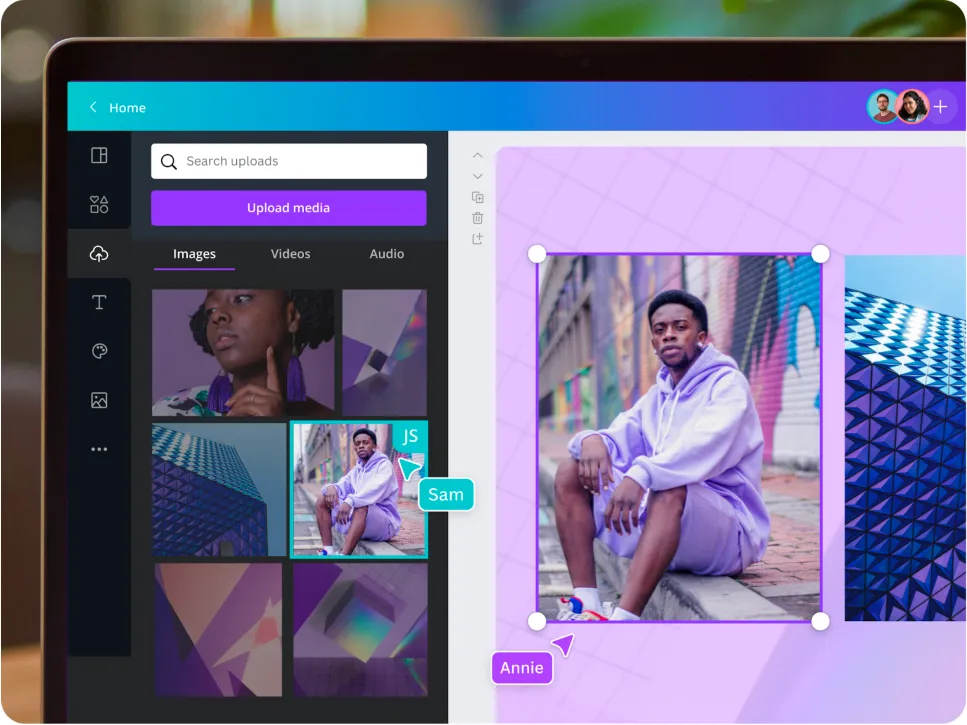
Canva wins on a different metric, which is how quickly someone who is not a full-time designer can produce something genuinely usable. That matters enormously in marketing, because a single campaign can need an Instagram carousel, Facebook creative, a LinkedIn graphic, a webinar cover, a presentation slide, an email banner, a sales sheet, and a few resized variations before the designer has even finished the hero image.
Why Canva stands out
Canva’s Visual Suite now stretches across social content, presentations, docs, emails, video, websites, print, whiteboards, and other everyday business formats. Its strength is not that every one of those tools goes deeper than specialist software, because it does not. Its strength is that a marketer can move between them without rebuilding the workflow each time.
The drag-and-drop editor keeps the learning curve low, while a template library measured in the hundreds of thousands removes the blank canvas problem entirely, which is usually the real bottleneck for a small team.
Brand Kit is the other practical advantage for teams, since logos, fonts, colors, icons, imagery, and brand guidance live in one place, so self-service design does not have to mean every department inventing a new visual identity. If your team produces recurring seasonal creative, that consistency matters more than raw design ambition, and our roundup of holiday email examples shows how much of campaign design is repetition done well.
Where Canva fits best
- Social media graphics
- Campaign assets
- Presentations
- Email banners and newsletter graphics
- Simple videos and animated content
- Quick brand-consistent assets for non-designers
Where it is not the best choice
Canva is built for speed rather than maximum control, so if you need a deeply structured UI system, advanced photo compositing, detailed vector paths, or a sophisticated production website, specialist tools will give you more room. For a marketing team that needs to ship a lot of good-looking creative without queuing every request behind one designer, though, Canva is hard to beat.
3. Adobe Photoshop: Best for Photo Editing and Image-based Design
Plenty of tools can remove a background now, and that does not make them Photoshop.
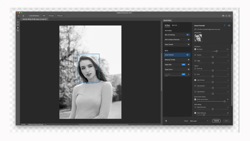
Photoshop still becomes the obvious choice when the actual pixels need serious work, including retouching, compositing, masking, color correction, product imagery, campaign visuals, textures, mockups, or any image that needs to look believable after three different photos have been stitched together.
Why Photoshop stands out
Layers and masks remain the foundation of the workflow, but Adobe has pushed generative editing much deeper into the app. Current Photoshop features include Generative Fill for adding, removing, or replacing objects, Generative Expand for extending a canvas, Generate Image for creating new visual starting points, Harmonize for blending inserted objects into a scene so the lighting and color actually match, and Generative Upscale for improving image clarity and resolution.
The key benefit is control, because you are not limited to asking an automated tool for a finished image and hoping it gets the details right. You can combine manual editing, selections, masks, adjustments, typography, effects, and generative features inside the same file, then take the result apart again when a stakeholder changes their mind.
Where Photoshop fits best
- Product photography
- Ad and campaign compositions
- Photo retouching
- Website hero images
- Social and email campaign imagery
- Mockups and image manipulation
Where it is not the best choice
Photoshop is too much tool for simple template work, so if the task is changing a headline, swapping a photo, and exporting six social sizes, Canva will usually get you there faster. And because Photoshop is raster-first, Illustrator is a better home for logos and graphics that must scale cleanly from a favicon to a billboard.
4. Adobe Illustrator: Best for Vector Graphics and Branding
A logo should not go fuzzy because somebody finally put it on a trade show wall, which is exactly why vector design still matters and why Illustrator remains one of the strongest tools for it.
Why Illustrator stands out
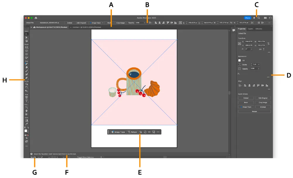
Illustrator builds artwork from points, paths, curves, shapes, and editable type rather than fixed pixels, so the result scales up or down without losing sharpness, which makes it ideal for logos, icons, illustrations, packaging, brand systems, infographics, print graphics, and advertising assets.
The traditional tools still carry the work, including the Pen and Curvature tools, Shape Builder, gradients, typography controls, and precise path editing. Adobe has also added newer workflows such as Concept to Vector, which turns a sketch or raster reference into editable vector artwork, alongside generative options for recoloring, filling shapes, and expanding artwork.
That mix is useful because generative features can accelerate exploration without forcing the final asset to stay a flattened image, and the vector output remains something a designer can reshape and refine afterward.
Where Illustrator fits best
- Logo design
- Brand identity systems
- Icons
- Vector illustration
- Packaging
- Print and large-format graphics
Where it is not the best choice
Illustrator has a real learning curve, and it rewards precision, which is excellent when precision is the job and frustrating when you only need a quick promotional post. If you are building brand assets that must stay sharp everywhere they appear, it earns that complexity.
5. Framer: Best for Designing and Publishing Websites
A beautiful website mockup is still a mockup, and Framer gets interesting because the design can become the website.
Why Framer stands out
Framer combines a freeform visual canvas with responsive layouts, reusable components, interactions, CMS content, SEO controls, collaboration, hosting, and publishing, so designers can start from a blank canvas, a template, a prompt, or an existing Figma design and keep refining the site visually.
For marketing teams, the design-to-publish workflow is the real win, because a landing page does not have to spend a week moving from a design file into another site builder before anyone can test the headline.
Framer also keeps content and production close together, since teams can manage CMS-driven pages, set metadata, adjust responsive breakpoints, preview changes, and publish without maintaining a separate codebase for a standard marketing site.
Where Framer fits best
- Marketing websites
- Landing pages
- Startup sites
- Portfolios
- Campaign microsites
- CMS-driven content sites
Where it is not the best choice
Framer is a website creation tool rather than a replacement for Photoshop or Illustrator, and it does not remove every engineering requirement, since complex web applications, unusual backend logic, and deeply customized product experiences still need a traditional development stack. But if the job is taking a polished marketing page design and getting it live quickly, Framer closes a gap that traditional design tools leave wide open.
Best Design Tools for Marketing Email Design
Marketing email is where the design workflow gets slightly strange.
You can create a gorgeous newsletter in Figma or Canva, but the inbox does not care how good the mockup looked, because the final email still has to be responsive, readable with images disabled, accessible, clickable, editable, and compatible with the system sending it. Our breakdown of email design trends covers where those constraints are heading, and the guidance on mobile optimized emails covers the layout rules most campaigns break first.
That means the smartest workflow is usually not designing the entire email as one giant image. Use the five tools above where they are strongest, then assemble the actual email with real text, buttons, images, links, and blocks inside your email builder.
How each tool fits into email design
Figma works best for planning the layout and creating an email design system, so you can define spacing, hierarchy, buttons, content modules, image ratios, and reusable patterns before production starts.
Canva is the quickest option for campaign banners, sale graphics, newsletter headers, event artwork, simple product collages, and other assets that marketers need to update frequently.
Photoshop belongs in the workflow when the email depends on polished photography, including product images, composited hero visuals, background cleanup, retouching, and campaign art.
Illustrator is the right place for logos, icons, badges, vector illustrations, and branded graphic elements that need to stay sharp on a retina display.
Framer is less relevant to the email body itself, but it becomes useful when a campaign points to a matching landing page, since you can keep the visual direction consistent from inbox to conversion page.
Then there is the production layer, and if your marketing stack runs on WordPress, FluentCRM gives you a Gutenberg-native email builder directly inside the CRM, so the design leaves the design tool and becomes a real, responsive email without a separate export step.
How to Design Marketing Emails with FluentCRM Using the Gutenberg Editor
FluentCRM v3 uses a Gutenberg-native email builder as its default editor, so if you already know how to work with WordPress blocks the workflow feels familiar: add blocks, move sections, style the email, insert media from the WordPress library, preview the layout, and save reusable patterns.
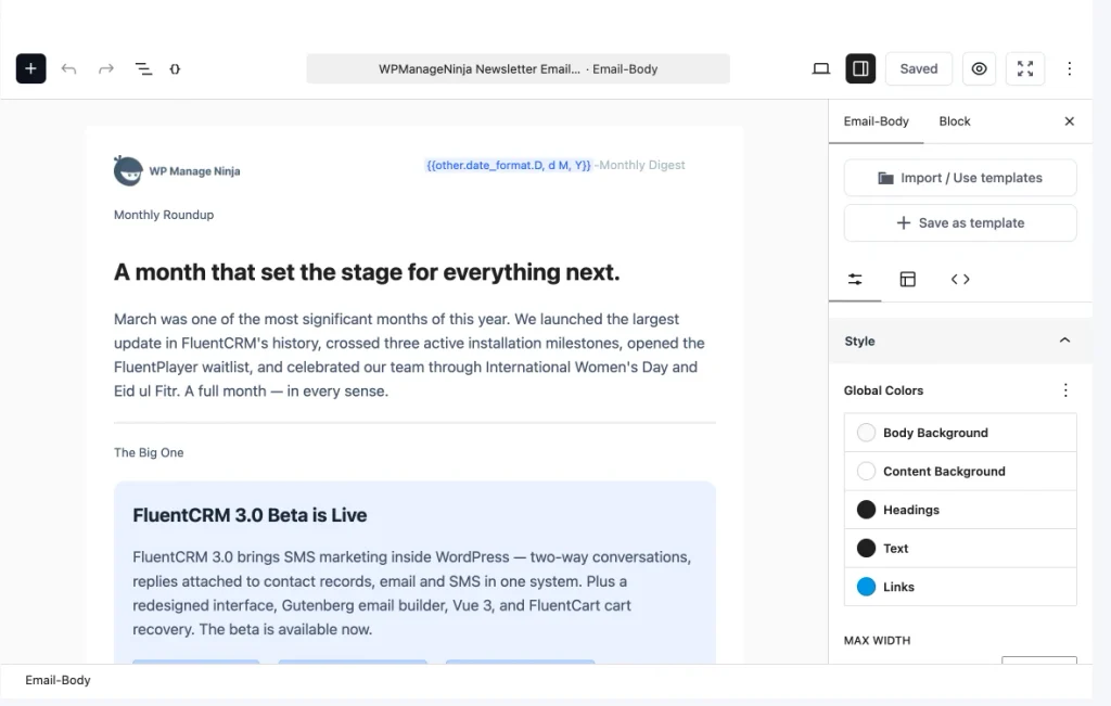
Step 1: Create a new email campaign
From your WordPress dashboard, go to FluentCRM → Emails → Campaigns and click + Add Campaign.
Give the campaign an internal title so your team can identify it later, then choose Default (Gutenberg) as the editor and create the campaign. FluentCRM also offers a Visual Builder, a Classic Editor, and Raw HTML, but Gutenberg is the one this workflow uses. If your team prefers a drag-and-drop canvas instead, the visual email builder covers that path.
Step 2: Set the subject and preheader before designing
Start with the information subscribers see before they open anything, which is the subject line and the preheader.
This sounds like copy work rather than design, but it shapes the entire hierarchy, because a short promotional subject may lead into a large visual hero while a newsletter subject may need a quieter editorial layout. If subject lines are where your campaigns usually stall, our email copywriting tips are a better starting point than another template.
You can insert FluentCRM SmartCodes into the subject and preheader using the {} control whenever personalization makes sense.
Step 3: Set the global email styles
Open the settings sidebar and use the Email Body controls before styling individual blocks.
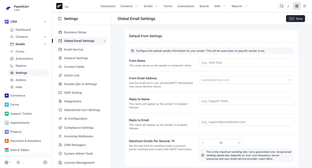
This is where you set the body background, content background, text and heading styles, font family, font size, line height, content width, and the overall template style. FluentCRM provides layout options including Simple Boxed, Plain Centered, and Plain Left, so pick the structure that matches the campaign instead of forcing every email into the same visual shell.
A useful rule: establish global typography, width, and background first, because otherwise you will spend the rest of the build fixing individual blocks that should have inherited the same design decision.
Step 4: Build the email structure with Gutenberg blocks
Click the + button or type / inside the editor to add blocks, and you can use familiar blocks for paragraphs, headings, lists, images, buttons, columns, tables, separators, custom HTML, RSS content, product blocks, and social widgets.
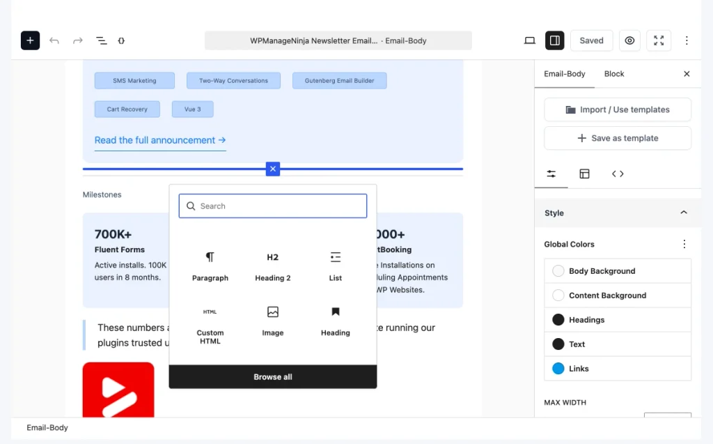
For a typical marketing campaign, keep the structure simple:
- Logo or small brand header
- One clear headline
- Hero image or campaign visual
- Short supporting copy
- One primary CTA
- Secondary proof, features, or offers only when they are genuinely needed
- Footer with required subscription information
Email is not a landing page squeezed into 600 pixels, and the strongest layouts usually make one message easy to understand and one next action easy to take.
Step 5: Bring in the visual assets you created
Export the image assets you need from Figma, Canva, Photoshop, or Illustrator, then add them through the WordPress Media Library.
Keep actual headlines, body copy, prices, and CTA labels as real email text wherever possible, and do not bake the whole message into the hero image, because real text adapts better to small screens, stays readable when images are blocked, and is far easier to personalize or edit later. Use images to support the message rather than to carry every word of it.
Step 6: Add personalization with SmartCodes
FluentCRM SmartCodes pull contact and CRM data into the email, and inside text blocks you can type @ or use the SmartCode control in the sidebar, while the subject and preheader use the {} control.
For example, {{contact.first_name}} inserts the subscriber’s first name, and a fallback such as {{contact.first_name | default: "friend"}} prevents awkward greetings when the contact record has no name stored. FluentCRM also provides CRM-level SmartCodes for business details and essential links such as unsubscribe and subscription management URLs.
Personalization should make the message feel more relevant rather than looking like a mail merge experiment, so use it where it changes the reader’s experience.
Step 7: Turn repeated sections into Email Patterns
If your team sends email regularly, you should not be rebuilding the logo area, CTA treatment, product card, signature, and footer every Tuesday.
The Gutenberg editor supports reusable Email Patterns, so you can use the editor’s three-dot menu to insert patterns and reuse approved structures across campaigns. This is where design work becomes a system, because you build the component once, agree on how it should look, and then let marketers reuse it without reconstructing the layout.
Step 8: Save full layouts as templates when appropriate
Patterns are useful for sections, while templates are useful when the entire email structure repeats.
From the editor options you can work with templates or save a completed layout as a template, which is ideal for recurring newsletters, webinar reminders, product update emails, monthly reports, and other campaigns with a stable skeleton. FluentCRM’s library of ready-made email templates is a reasonable place to see how those structures are put together before you build your own.
Step 9: Preview the email on desktop and mobile
Do not assume a narrow email will automatically look right on a phone.
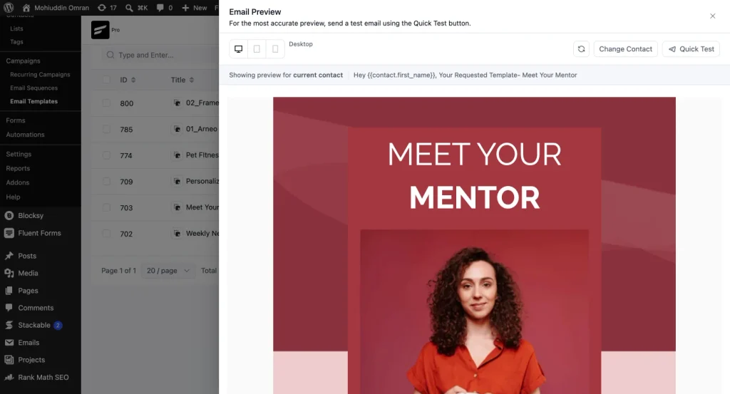
Use FluentCRM’s device preview to inspect the desktop and mobile versions before you send, and look specifically at headline wrapping, button width, image scaling, white space, multi-column sections, and whether the primary CTA still appears early enough on a small screen.
Step 10: Send a test email and check the real inbox
The preview catches layout problems, and a real test email catches everything else.
Send a test, open it on the devices and email clients your audience actually uses, click the links, check the images, and read the copy in context. It also helps to run the campaign through dedicated email testing tools when deliverability or rendering across clients is a recurring problem. Note that contact-specific SmartCodes may not render with real subscriber data in a test email, so do not treat that as proof personalization is broken.
And because FluentCRM handles the CRM and campaign workflow rather than mail delivery by itself, make sure your WordPress site has a properly configured sending setup, where FluentSMTP is the natural option if you want to keep that part of the stack inside the Fluent ecosystem.
A Practical Email Design Workflow
If your team already uses FluentCRM, a clean workflow looks like this:
- Plan the layout or design system in Figma when the campaign needs custom art direction.
- Create fast campaign graphics in Canva when the marketing team needs self-service assets.
- Use Photoshop for photo-heavy hero images and product visuals.
- Use Illustrator for logos, icons, badges, and scalable illustrations.
- Build the actual email with Gutenberg blocks inside FluentCRM.
- Save repeated sections as Email Patterns and recurring layouts as templates.
- Preview on mobile and desktop, then send a real test before the campaign goes out.
- Test one variable at a time once the design is stable, using A/B testing in email marketing to find out which version actually performs.
This keeps visual design flexible without turning the final email into an inaccessible screenshot.
Which Design Tool Should You Choose?
- Choose Figma if your work revolves around interfaces, prototypes, design systems, and collaboration.
- Choose Canva if marketers and content teams need to create branded assets quickly.
- Choose Photoshop if photographs and pixel-level image editing are central to the job.
- Choose Illustrator if you are building logos, icons, illustrations, packaging, or other vector assets.
- Choose Framer if your design needs to become a live marketing website without a long design-to-development handoff.
And do not be afraid to use more than one, because a real campaign may start in Illustrator, move through Photoshop, get laid out in Figma, produce social variants in Canva, land on a Framer page, and reach the audience through a FluentCRM email.
The point is not to build the biggest software stack, it is to make sure each tool removes more friction than it adds.
Frequently Asked Questions
What are the best design tools in 2026?
Our five picks are Figma for UI/UX and collaborative digital design, Canva for marketing design, Adobe Photoshop for image editing, Adobe Illustrator for vector and brand design, and Framer for designing and publishing websites.
What is the best design tool for beginners?
Canva is the easiest starting point for most beginners, because its drag-and-drop workflow and template library make it possible to produce useful work quickly. Figma is also approachable if the goal is UI/UX design, though it takes longer to understand responsive systems and components.
What is the best design tool for professional graphic design?
It depends on the output, since Photoshop is strongest for raster and photo-based work while Illustrator is stronger for scalable vector graphics, logos, icons, and branding. Many professional workflows use both.
What is the best design tool for marketing teams?
Canva is the most practical general-purpose choice for fast marketing assets, while Figma is better when a design team manages structured campaign systems, and Photoshop and Illustrator handle specialist image and vector work.
What are the best design tools for marketing email design?
Figma, Canva, Photoshop, and Illustrator all fit different parts of the email design workflow, so use them to create the layout direction and visual assets, then build the actual responsive email with real blocks and content inside an email builder such as FluentCRM.
Can I design an email directly in FluentCRM?
Yes. FluentCRM v3 includes a Gutenberg-native email builder with blocks, global styling controls, WordPress media, SmartCodes, reusable Email Patterns, templates, and desktop and mobile preview.
Should I design my whole marketing email as an image?
No. A single-image email is harder to read when images are blocked, less flexible on mobile, poor for accessibility, and awkward to personalize or edit, so use images as supporting assets and keep the core message, links, and CTAs as real email content.
Final Thoughts
The best design tool is not the one with the longest feature page, it is the one that fits the thing you are actually trying to ship.
Figma makes digital design systems easier to manage, Canva makes everyday marketing design faster, Photoshop gives you control over pixels, Illustrator keeps vector work precise at any scale, and Framer turns visual web design into something you can publish.
And when the design ends up in an inbox, treat the email as a real interface rather than a poster. Create the visual ingredients in the design tools you work fastest in, then assemble the message with responsive blocks, real text, reusable patterns, and a sending workflow built for email.
That is where good design stops being a mockup and starts doing its job.
Mohiuddin Omran
Email Deliverability Specialist
Mohiuddin Omran is a mathematician with a passion for writing. A technology enthusiast and a keen follower of software trends dealing with digital marketing at FluentCRM. When not in the workspace, you’ll find him roaming with his friends.
Table of Content
Related Articles and Topics
-
How to Drive More Engagement with WhatsApp Marketing Inside WordPress
You might be sending emails to your contacts regularly. It might be: All of them…
-

WhatsApp Marketing Strategy: A Complete Guide for Businesses in 2026
Some customer moments need more than email. A purchase confirmation, an important update, or a…